Simplify your Landscape Photography Composition
When I coach aspiring landscape photographers, I always mention one golden rule: Frame your subject and, once you are absolutely happy with your composition, take two steps forward because your landscape photography composition should be about highlighting your subject.
Photography is a communication between you and all the viewers that enjoy your work. Every piece of communication has a subject at the center. Some information that you, as the landscape photographer, want to communicate.
Before pressing the shutter release, clarify your landscape photography composition subject that attracted you to a scene in the first place. Something that sparked a thought in your mind with the intent of capturing it in a photograph. It’s often something you love.
Defining & Isolating your Subject
The subject of a landscape photo can be a single physical object in a scene (typical for landscape photographer), a person (typical for portraits), an arrangement of objects, a feeling or a mood. In this article, we focus on landscapes.
A common mistake for aspiring landscape photographers is the desire to show as much of a scene as possible, where the scene itself becomes the subject. The viewer is lost in an image that doesn’t have a clear piece of information being conveyed.
Isolate your subject to make it stand out. Be it an object or a feeling. Make it the center of your conversation with the viewer. Everything else around is there to support your story about the subject.
Bowling Beach Balls

Creating a feeling of peacefulness by landscape photography composition – Bowling Balls Beach, California by Francesco Carucci
The subjects of Bowling Beach Balls appears to be the polished rocks but, while shooting this image, I wanted the subject to be the feeling of peace. I chose the object (polished rocks) and its position accordingly to evocate calmness, tranquility, stability by virtue of the centered composition that is inherently immobile. All qualities of the concept of peace. The water flowing around immovable round rocks reinforces the subject. The muted color palette also supports the subject. I got as close as possible to the foreground to leave out anything that would potentially be distracting.
Simplify your Landscape Photography Composition
Anything else that does not support your subject must stay out of your image.
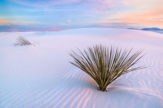
Dunes at White Sands National Monument
As the title suggests, the subject of this image is the beautiful white dunes in the White Sands desert in New Mexico. I chose to place the subject in the background rather than the foreground, where I instead placed a bush. The choice is deliberate.

Photographing composition showing ripples in sand & the plant in foreground – White Sands, New Mexico by Francesco Carucci
The subjects of my images are where I want the viewer to spend most of the time looking at my photos. In White Dunes, both the ripples in the sand and the plant in the foreground form leading lines that take the viewer straight to the gentle dune. The dune is also framing the plant in the foreground, giving another visual clue about its importance. Every choice in this image – composition, colors, placements, title – supports the subject I chose. The white dunes.
In the following video, I explain in more detail my landscape photography composition choices, my feelings, in front of this beautiful scene.
Mount Seguret, Italian Alps
The subject of Seguret is the most straightforward in this series of images. The majestic mountain in the Italian Alps is framed very tight and it fills the entire frame. There is no ambiguity on the subject I chose here nor the message.
The choice of black and white to show the rocky structures of the mountain reinforces the choice and makes the subject stand out. The brightest areas are leading the viewer to the top of the mountain when the clouds are forming. This image is clearly about an imposing piece of rock.
Svan Towers in Mestia, Svaneti, Georgia
The Svan Towers are unique historic buildings in the Svaneti region, in the beautiful country of Georgia in the Caucasus. I chose this subject because of its historic important and beauty. I placed the Svan Towers at the bottom of the frame to evoke stability, while still occupying a good portion of the frame.
The huge mountain top (5000 meters tall – more than 16000 feet) peaking through the clouds offers context to the image. It gives the viewer clues about the location where my subject has been standing for more than 900 years! To make the towers stand out even more, I slightly brightened and sharpened them in post processing. The eye is drawn to bright and sharp areas of an image.
Endless Falls IV
This is a typical intimate landscape, shot with a long focal lens, where the subject is the concept of contrast itself.

Landscape photography with contrast to highlight the subject from black walls falls in Uvas Canyon, California
This concept is reinforced by every choice in the image. The monochromatic look on the left, compared to the brightly colored lead on the right. The dynamic flow on the left, to the static leaf on the right clinching to the rocks. The closed shadows with large black areas and the bright highlights sparkling on the rock and in the water further support the idea of contrast.
Taking two steps closer to your subject is a simple and straightforward way to make your subject stand out. And it’s something you can start using today in your photography. But it’s not the only technique. We also explored how to use leading lines to clearly convey what your subject is. We talked about how to use colors to support a feeling or an emotion, if that is what you chose as your subject.
The placement of your subject in a scene is also very important to make it stand out, but requires some knowledge of the intended audience. A western audience tends to read photographs from left to right. You might want to consider placing your subject on the right of the frame. This gives the viewer time to enter the image from the left, explore it, and finally rest on your subject on the right. If the audience is mainly eastern, you might want to instead place the subject on the left of the frame.
You now have more tools in your toolbox to tell the story that you love through your photography. Go out there, choose the subjects you love and make some great photos!


The second photo (the one with the dunes) is not great – it’s technical ok, but the gras on the right take the eyes off the ripples.
Thank you for your message. Composition is a tool to tell a story. The story of White Dunes is about the… white dunes. Not the ripples. The bush on the right, having a similar shape to the dune above, is deliberately used to frame the dune and it also offers an anchor point for the eyes before the viewer follows the ripples to the dunes in the background.
This photo has won several awards, including a place in the Loan Collection at this year International Photographic Competition and Photo of the Month of the Landscape Photography Magazine, which suggests the compositional choices I made work for several people.
I disagree. The plant makes a great foreground object in this photograph. It draws the eye immediately into the image and on to the ripples, which lead the eye to the background. The plant, also, aids in the indication of motion (the effect of wind on the ripples, by blocking or redirecting the wind, causing the ripples to bend around the plant, adding more interest to the image.