Creative Processing Tips using Topaz Software
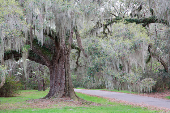
I chose to work on the image above because I liked the tree with the Spanish Moss draped over the limbs. I also liked the way the “path” led into the image. I did not, however, like that the “path” was an asphalt road and that it was obvious in the photo. Because I work a lot with filters and plug-ins, I knew when I captured this image that it had appealing elements that would work well together. I also thought immediately of a B&W conversion as another possible way to blend the road into the scene. So that got me thinking and I came up with the idea of combining Topaz Impression with Topaz B&W Effects.
To start bring your base image into Photoshop and duplicate the layer, Ctrl J or Cmd J (MAC). Then bring your top layer into Topaz Impression. Go to Filter> Topaz Labs> Topaz Impression.
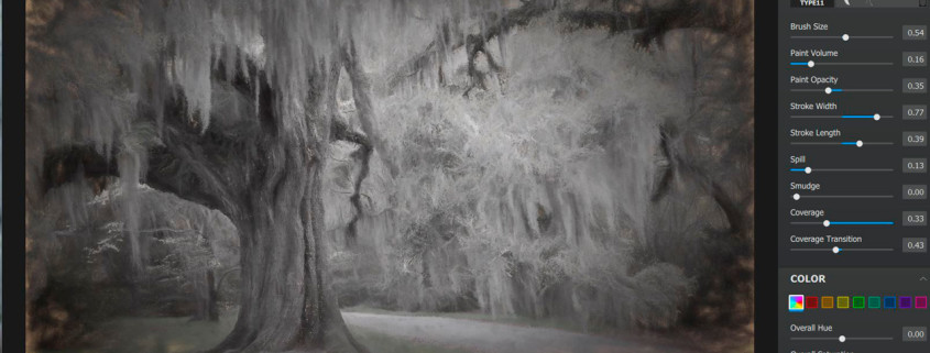
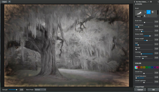
Once the image opens in the Topaz Impression interface choose the Da Vinci Sketch Preset and be sure to click on the correct Brush (highlighted in blue above). Then apply the settings as per the screen capture. Also note that the opacity slider is set to .89 and that my blend mode is at the default: Normal. The settings that are not shown in the screen capture area are left at the defaults. Then hit OK. The image will return to Photoshop. At this point I like to duplicate the image again just in case I need to tweak the settings as I move forward.
Now bring the image into Topaz B&W Effects. Under Effects I chose “Traditional Collection” and from Presets I chose “Warm Tone 1″. Under Local Adjustments I used the Dodge Tool to paint some light onto the image. (See the masked area on the bottom portion of the screen capture above). Under Finishing Touches I selected the “Grungy White 4” border and made some adjustments to the size of the border.
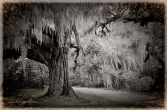
Once the image is back in Photoshop you will see both the Impression layer and the B&W layer. The B&W layer will be on top. Change the blend mode to ‘Soft Light”. You don’t have to do this step. You could leave the image as it appears in the screen capture above. I like the way the blend mode smooths the transition between the photo and the border. It also adds some depth to the image. Final tweaks include cropping away a tiny portion of the border along with adding a touch of contrast and sharpening. See the final image below.
Ready for more creativity? Check our Deinse Ipollito’s work on her website.


