3 Effective Photography Composition Tips to Simplify a Photo
If you struggle with trying to simplify your photo then you are not alone. Simplifying a landscape photography composition can be difficult, but it starts with choosing your subject. Look for subjects that draw the eye and stand out from its surroundings. Simple landscape photography compositions are particularly difficult in cluttered locations. Here are three highly effective ideas photography composition ideas to simplify a photo:
- Eliminate distracting elements from your landscape photography composition.
- Make your subject a large part of your landscape photography composition.
- Crop your landscape photos in post processing to create impact with your photography composition.
Let take a look at each of these idea an more details:
#1: Eliminate distracting elements
How do you deal with distracting compositional elements in landscape photography? The easy answer is to just remove them. But that’s not always possible. It’s also not always possible to simply exclude them from your landscape photo either by cropping or by shooting from a different perspective.
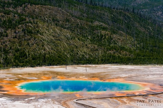
Landscape photography composition with distracting board walk, Grand Prismatic, Yellowstone National Park, Wyoming
Take a look at the Grand Prismatic photo above. The boardwalk included in this photo is an integral part of this landscape photo because every visitor uses it to view the magnificent hot spring. Without the boardwalk, the photo would be unreal. THIS is the reason I choose not to close the board walk out of my landscape photo. Here are some other reasons why a compositional element cannot be easily removed from your image.
Out of Reach Objects
It would have been impossible to capture this scene from this angle without including at least a part of the Dancing Tree on the left.
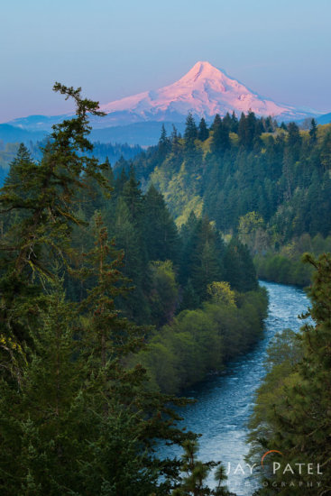
Including distracting element of dancing tree in photography composition – Mt. Hood Wilderness, Oregon
Instead, I made it a part of the composition by placing it and the mountain using the rule of the thirds. I chose my focal length carefully so that both the mountain and the tree were similar in size. I used the river as a line to lead the eye towards the mountain.
Restriction of Movement
Places such as Yellowstone restrict your movements. It may be quite impossible to get the best possible composition. In this case, we tried to include elements that are present at the location to make for an interesting photo.
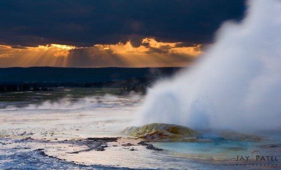
Photography composition opportunities were limited due to restricted access, Yellowstone National Park, Wyoming
When I saw these spectacular beams of light, I decided to include the exploding geyser to add an interesting element to the photo.
Man Made Objects
Boardwalks like the one you find in Yellowstone often pose as distracting elements. Sometimes it’s possible to create an interesting composition by including these elements as part of your image.

Using fence to create a leading line in landscape photography composition, Olympic National Park, Washington
Above are a couple of example from Olympic National Park, I used man-made objects to form a leading line for my landscape photography composition.
So the next time you’re faced with the question of how to deal with distraction elements, why not make them a part of your landscape photography composition?
#2: Use cropping to simplify a photo
Does “one size fits all” really make sense? I know I’ve made the mistake of buying a garment that claims to be OSFA only to find that it sure as heck doesn’t fit ME! Similarly, we can’t possibly expect every landscape photo to fit neatly into the camera’s standard 3×2 format. Rather than feeling confined by the frame the camera offers, consider cropping your landscape photo to make the photography composition more effective.
Here are few tips you crop your landscape photography composition:
Panorama
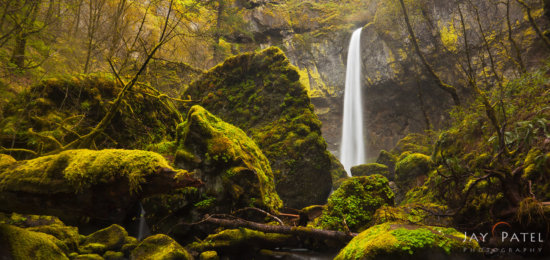
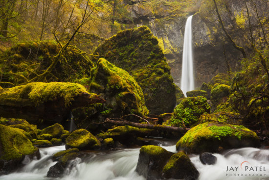
This panoramic image was created by cropping out the distracting, uneven foreground shown in the original image below.
The waterfall is the central point of interest – it stands out because it’s brighter than the surrounding area. The foreground in the original shot adds little or nothing to the photo. In fact, it’s somewhat distracting. A quick and simple crop removes the distraction, leaving us with an effective photo in an unusual and attention-grabbing format.
3:4 Crop
I have to admit that the square (or 4:3) crops are not my favorite; however, most interior designers I’ve dealt with prefer the 4:3 crop.
For this reason, we sell a lot more of 4:3 fine art images then 3:2. If I know that the image is going to be used for fine arts, I try to select the composition to allow a little extra room to crop and create a 4:3 composition without losing the most critical elements in the scene… especially if the scene has a strong point of interest.
16:9 Crop for Videos
These days, we produce a lot of videos and the video format calls for a 16:9 format image. It’s possible to use a vertical image in a video, but the impact is not quite as good as using a horizontal formatted image.
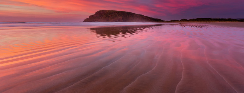
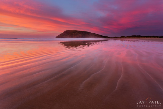
For this reason, when we are shooting a video course, we always add extra space above and below the point of interest for any photo taken with a 3:2 DSLR. Here’s an example that shows where we used this gorgeous shot from Cannibal Bay in New Zealand in both 3:2 format as well as 16:9 format. The 16:9 format was featured in our Sales and Intro videos, while the 3:2 format was used as a feature image on the sales page and in other promo materials.
The next time an image doesn’t feel quite right in its 2:3 frame, see if a crop helps to make the image more effective. When it comes to photography, one size most definitely does NOT fit all.
#3: Fill the frame with your landscape photography subject
Ashis-Lepa Wilderness Area is beautiful place in New Mexico and provides a wonderful opportunity for landscape photography. These rocks sit on a smooth stretch of white ash and clay. The rocks themselves show striking evidence of erosion in the patterns and layers on their surface. It’s totally cool!
The challenge is to find a simple photography composition that isn’t cluttered, and to show the incredible details in the rocks without losing that beauty in all that clutter. To do this, I chose a single rock as a point of interest, and moved my camera until the rocks behind it formed a smooth curve. I got as close as I could to the rock in the foreground. This serves a dual purpose. To simplify this photo, I fill the foreground with a single object. This gives the viewer as much information about the site as possible – so they feel as though they could walk right into the image. The rocks in the background seem smaller because of the wide angle lens.
In post processing, I was careful about setting my color balance correctly. The sky needed a slightly different setting than the foreground since they are lit differently. It’s critically important to realize that over or under exposure can actually be distracting – so getting the exposure right helps eliminate distractions too.
Another trick to simplify a photo that is to use a telephoto lens for landscape photography compositions. Don’t try to include the whole scene in the finished image – instead, choose a very simple composition that showcases just one area or object.
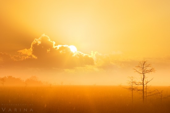
Varina used a telephoto lens to simplify her landscape photography composition in the above image from Everglades National Park in Florida. She wanted to capture the rich warm tone around the horizon as the sun was coming up. It’s ok to have a secondary compositional element in your shot (tree on the right side)… but avoid including too many distractions in your landscape photo.
Besides the techniques listed here landscape photographers use lots of other techniques to simplify a photo. If clashing colors are distracting – try converting to black and white. If dark shadows or bright highlights draw your attention away from the subject, use a diffuser to soften the light. Look for colors that are similar for a simplified color palette.
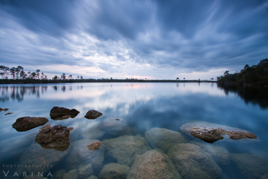
Simplifying a landscape photo with slow shutter speed, Pine Glade Lake, Everglades National Park, Florida
You can also use a long shutter speed to smooth the surface of a lake or pond to remove ripples on the surface. And sometimes I use a wide aperture to create a narrow depth of field that softens a distracting background. What techniques do you use to simplify a composition? Feel free to share examples and ideas in the comments!

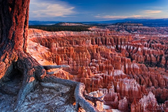




Depth of field is another great way to simplify images. Having only a small section in focus and the rest fade away into softness.
Here are two examples:
Stamen of Lilly
Stigma
Simple pictures are always best for lots of reasons: 1)viewers many times don’t give the image enough time to discover its “layers” of sublity
2) A great image is pretty damn good at first glance
3) Complexity is fine but it takes time to visually ferret out the details. Time is certainly a plus and should add to its value but only the very astute appreciate this marvelous asset.