Basics of Complementary Colors
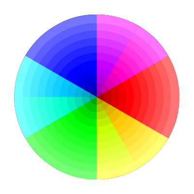
When we’re out photographing the beauty of the natural world, we often take for granted the array of colors before us. After all, most of us can see the full spectrum of colors on any given day so why give it a second thought. However, color plays a very important part in our photography and should be considered as one of the fundamental elements, just as composition and light are. Specifically, the use of complementary colors can draw a viewer in and keep them interested. No, I’m not talking about one color telling the other color that they’re an above average dancer. Not that type of compliment. Complementary colors are colors that exist on opposite sides of the color wheel. Prepare yourself as I jump back to 4th grade science for a minute.
If we take a look at the color wheel, we can see that the complement of blue is yellow and the complement of green is magenta…opposites. Utilizing these contrasts can actually alter the mood of a photograph. The use of a strong color complement can either create tension between elements or even balance them.
In the image below, I used the opposites, green and magenta, to draw attention to the relationship between the palmetto leaf and the azaleas resting on top of it. I was on my way to lunch with a workshop group but simply had to stop and capture this elegant scene. The strong complementary colors made me stop in my tracks. And I’m hypoglycemic so taking a pause on the way to lunch was a big deal! I knew it would be worth it.

Complementary Colors: Azalea on Palmetto Leaf
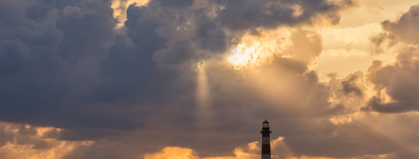
The image below of the Morris Island Lighthouse near Charleston, SC is a more subtle use of complementary colors. Blue and yellow are shown here in the same image and help add to the mood of this sunrise scene. While not being too saturated, the two colors are still prominent throughout the image in varying shades.

Morris Island Lighthouse
Along with the colors that are opposites on the wheel, there are also color harmonies such as green and yellow, red and orange, blue and purple. Notice that these color combinations are not opposite on the wheel, but right next to one another. Choosing to include subject matter in your images that highlight these relationships can enhance your images and make them more pleasing to the viewer.
Here I chose to create a color harmony by adding a photographic texture to my image. I used a primarily yellow and orange texture to go with a reddish air plant because those colors are near each other on the color wheel.

Air plant
I hope the next time you venture out to photograph nature, that you’ll see its’ colors in a whole new light! And don’t forget, opposites attract!


I noticed the color wheel used is not the same that we all painted all those years ago in art class. Perhaps some discussion on why the one selected is appropriate would help. Thanks.