How to use Negative Space in Macro Photography
Learning how to use negative space in macro photography can transform your close-up images from cluttered snapshots into striking, visually balanced compositions. In this article, you’ll discover what negative space is, why it’s just as important as your subject, and how to use depth of field, clean backgrounds, and texture control to create compelling macro images.
What Is Negative Space in Macro Photography?
Negative space refers to the area surrounding your main subject. In macro and landscape photography, it’s not just “empty space”—it’s a vital compositional tool that shapes how your viewer perceives the subject. Negative space defines the mood of the photograph, provides a sense of scale and place, and either enhances or distracts from the main subject.
In macro photography, where every millimeter counts, the role of negative space becomes even more significant. Because of the shallow depth of field and tight framing, even small distractions in the background can overpower the subject. A well-handled negative space allows your subject to breathe and creates a visual pause that enhances the story you’re trying to tell.
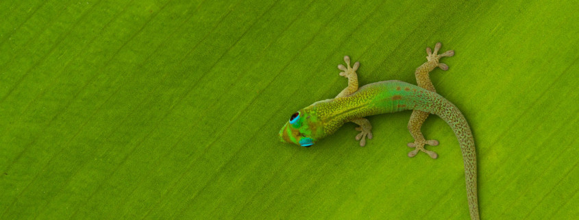
When photographing the image below, for example, the Hawaiian gecko serves as the subject, and the area around it forms the negative space.
Why Negative Space Matters in Macro Photography
As macro photographers, we often focus intensely on our main subject—the insect, the droplet, the leaf’s vein—but forget to consider what surrounds it. Yet, the background and surrounding elements can make or break an image.
Unlike still life or controlled studio setups, photographing living macro subjects presents unique challenges. A gecko, butterfly, or beetle won’t wait patiently while you fine-tune your composition. The subject’s movement constantly alters both the framing and the negative space, requiring the photographer to anticipate, adapt, and react quickly.
The challenge lies in managing the balance between subject and surrounding space—and ensuring that the negative space supports rather than distracts from your composition.
Remove Background Distractions
Unwanted background distractions are among the most common issues in macro photography. Leaves, stems, bright reflections, or uneven lighting can easily creep into your frame, especially when you’re dealing with moving subjects.
Living creatures move unpredictably, forcing you to constantly adjust your framing. Often, if you get too close, the subject disappears entirely. Unlike inanimate macro subjects, where you can reposition the object or background, living subjects demand patience and timing.
In the first example below, Jay Patel’s initial attempt to photograph a Hawaiian gecko resulted in a cluttered background full of leaves and stems. This visual chaos in the negative space pulls attention away from the subject.
Through cropping and careful cloning, some distractions can be reduced. However, even post-processing has limits when the background is too busy.
This example highlights an essential lesson: it’s always better to eliminate distractions in-camera rather than rely on editing later. Paying attention to your negative space during composition helps avoid time-consuming fixes and results in a cleaner, more intentional image.
These types of distractions for a living macro photography subject are fairly common. Living subject go in and out of your frame based on where the subject is going and the direction you are trying to photograph. More often than not, a living subject will disappear if you get too close. So, unlike a lifeless macro photography subject which can be easily moved to optimize negative space, optimizing negative space for living subject is a challenge for macro photographers.
Eliminate Competing Textures in Your Macro Composition
Another subtle but powerful issue in macro photography is the presence of competing textures and colors in the negative space. Many small living subjects—like geckos, frogs, or insects—naturally blend into their environment as a form of camouflage. While this serves them well in nature, it can create problems for photographers trying to isolate the subject.
In the photo below, a gecko flattened itself against a leaf as Jay approached. The leaf’s intense texture and color matched the gecko so closely that the subject nearly disappeared into its surroundings.
Although the tree in the background offered a more uniform tone, the gecko’s position wasn’t ideal. When Jay tried to move for a cleaner composition, the gecko—true to its nature—scurried away.
The key takeaway here is that texture harmony matters just as much as color contrast. If the textures in your negative space closely resemble those of your subject, your composition can lose impact.
Now compare that to the examples below, where textures and colors complement rather than compete with the main subject.
In both cases, the textures in the negative space add context but don’t steal attention. The crab stands out against the watery bubbles because of its distinct size, shape, and color. Similarly, the seed pods on Big Island of Hawaii remains visually dominant because its form contrasts with the patterns behind it.
When the negative space harmonizes with the subject, the composition feels unified and balanced without becoming monotonous.
Use a Narrow Depth of Field to Simplify Negative Space
One of the most effective ways to create clean negative space in macro photography is by controlling depth of field.
Macro photographers naturally work with shallow depth of field due to the close focusing distance. By using a wide aperture (such as f/2.8 or f/4), you can blur the background into a soft, creamy wash of color that makes your subject stand out sharply.
A narrow depth of field removes clutter and distractions while drawing the viewer’s attention directly to the subject. This is particularly useful when photographing in dense natural environments where leaves, branches, or soil textures can interfere with the visual clarity of your image.
In these examples, the soft blur created by a wide aperture transforms potentially distracting environments into pleasing, minimalist backgrounds. The resulting negative space feels intentional and supportive, allowing the subject to take center stage.
For photographers seeking to emphasize form, color, or detail, mastering depth of field control is an essential skill for optimizing negative space.
Find a Uniform Background for Your Macro Subject
Sometimes, the best negative space isn’t blurred—it’s uniform. A consistent background color or tone can be equally effective in isolating your subject, even when textures and details remain visible.
Achieving uniform backgrounds in nature, however, can be challenging. Living macro subjects rarely stay still, and natural environments are rarely uniform. Here, patience and observation become your best tools.
In the image of the Hawaiian gecko, the background is not blurred, yet the gecko stands out beautifully. The similar colors and textures between the gecko and leaf don’t cause confusion because of the difference in scale and form. The gecko’s body contrasts with the leaf’s repetitive patterns, making it visually distinct.
Similarly, the back-lit snail stands apart because of the interplay between light, size, and color. The uniform negative space enhances the subject’s glow, turning a simple composition into a captivating visual story.
Uniform negative spaces don’t need to be plain—they just need to be non-competing.
Tips for Mastering Negative Space in Macro Photography
To create effective macro photographs that use negative space well, keep these practical tips in mind:
🟢 Pre-visualize your frame: Before taking the shot, notice not only your subject but everything around it.
🎯 Adjust your shooting angle: Sometimes a small change in perspective eliminates background clutter.
🌿 Use distance to your advantage: Step back slightly to give the subject more breathing room, then crop if needed.
💡 Pay attention to light direction: Backlighting can create soft gradients that enhance negative space.
📷 Practice patience: Especially with living subjects, the right combination of subject placement and clean background often requires waiting for the perfect moment.
Conclusion
Negative space in macro photography is far more than just “background.” It is the silent storyteller that defines mood, emotion, and focus. Whether you’re photographing a tiny gecko on a leaf or a droplet resting on a petal, paying attention to the space around your subject can elevate your image from ordinary to extraordinary.
By learning to recognize and control negative space—through depth of field, composition, and awareness of texture—you gain the ability to create more balanced, intentional, and visually powerful macro photographs.
The next time you’re out in the field, remember: your subject may capture attention, but it’s the negative space that completes the story.

