Color Cast: Seek and Destroy
It happens to all of us… you’re happily editing away on an image like a merry photographic elf when you decide to take a break to let your eyes rest. You come back 30 minutes later and say to yourself: “Oh my goodness! Why is that photo so orange?? How could I not see that before??”
The problem here is twofold. First, human eyes and brains are exceptionally talented at seeing colors as we expect, not as they actually are. This is why you can see a piece of white paper as white whether it’s in shady, sunny, or fluorescent light. When truthfully, the light coming off that paper is anything but white. The same thing happens when you’re post-processing. Without a truly neutral reference point, it’s difficult to see small shifts of color. Even if you have something neutral within your image, like the cascading streams of a waterfall, your eyes tend to take their cues from that “neutral” color. Meaning, if the color of your waterfall is shifted to the warm side of neutral, your brain will happily shift ALL the colors in your image to the warm side so that the expected color balance is maintained.
The other thing that’s going on is that humans are really poor at detecting subtle changes. We need something to leap out and smack us in the face before we notice that it’s changed. Meaning that, when you tweak your white balance a little bit here, a little bit there, your brain has a hard time discerning what’s a significant change and what’s not. This is why small, incremental shifts in color can go relatively unnoticed even if they add up to a big change overall.
So, if the problem in both of these situations is that our color shifts are too subtle for us to notice, then the solution is simply to MAKE THEM BIGGER. A really easy way to do that is to crank your saturation to +100. At maximum saturation, subtle colors become garish, and small shifts in color balance become big ones. This makes it much easier to tell whether or not your photo has a good color scheme.
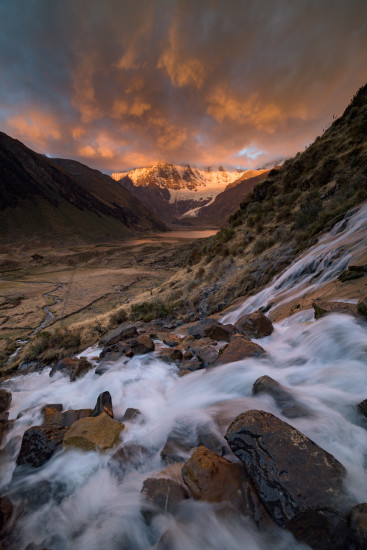
For example, here’s a photo of a waterfall and some mountains in Peru. After some initial editing, I had a rough draft of the image which I thought was looking pretty good: the sky was on fire, the water was fairly white, and the dry fields were looking, well, dry.

But when I pushed the saturation to 100, I could tell I actually had an overabundance of warm tones in the image. Everything, including the “neutral” water, was clearly dipping its toes in the amber side of the pond.
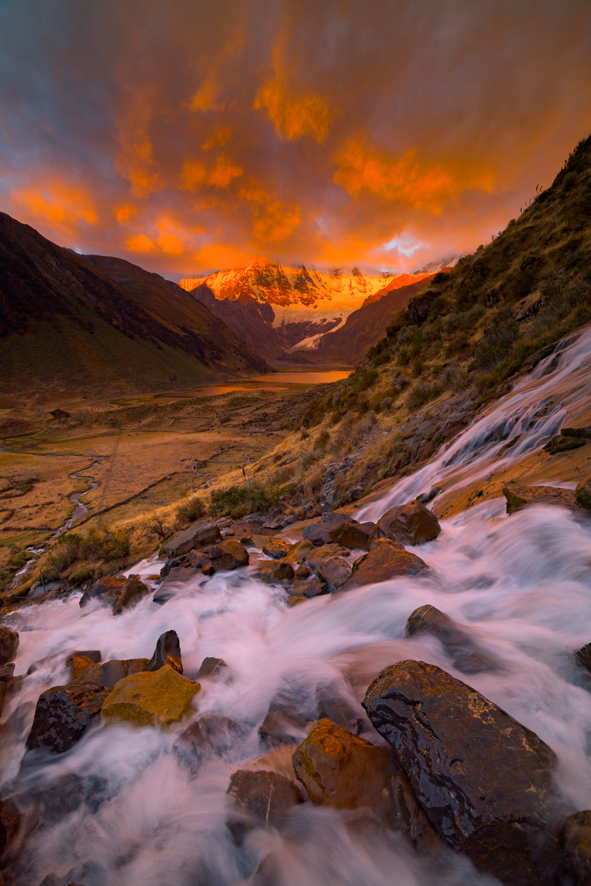
Seeing this, it was a quick and easy adjustment to cool the image down to achieve a more neutral white balance, as well as remove some excess magenta to help the plants look a truer green.

From there I reduced the saturation back to the level it was previously, leaving me with an image with a much more natural color balance.

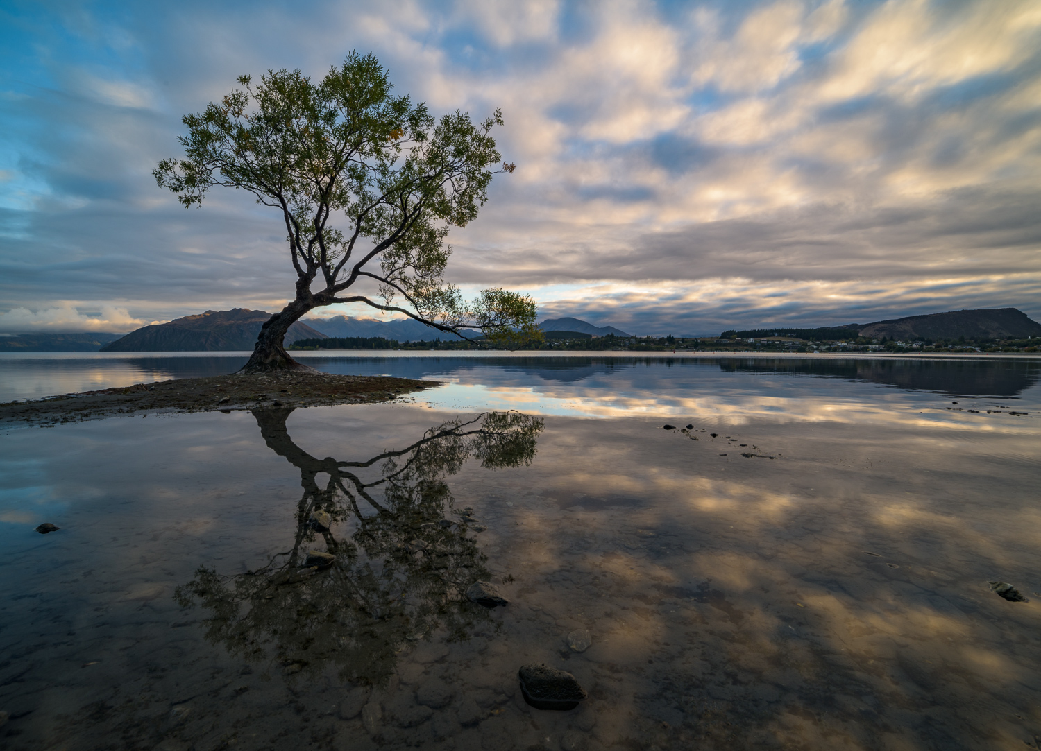
Let’s take a look at another example, this time from a beautiful sunrise at the Wanaka Willow in New Zealand. After some initial processing, I was left with this image which appears to have a good balance of warm and cool tones in the sky and the reflection.
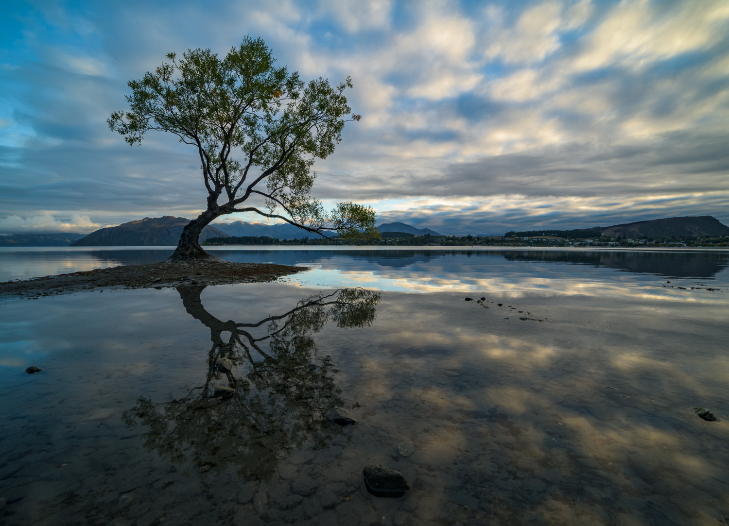
But after juicing the saturation, I can see that cool tones actually dominate the image and, in places in the sky, there is actually a subtle green tint.

Seeing these colors much more obviously makes it a piece of cake to add some warmth to balance the blue tones and pop in a dash of magenta to neutralize the green.
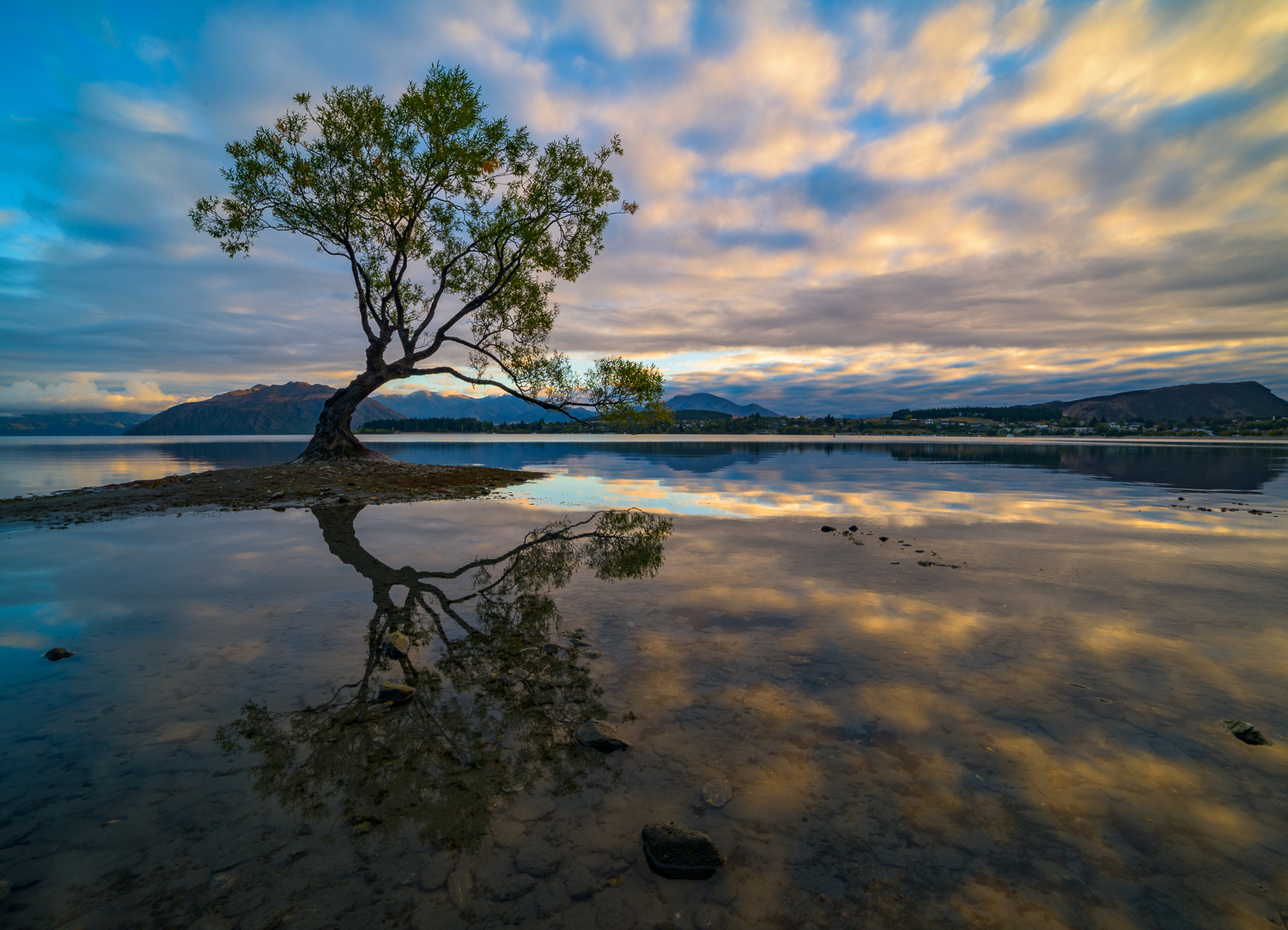
Then, after reducing the saturation back to a reasonable level, I’m left with a much more pleasing color scheme to the photo.
It’s a simple but powerful technique. By reverse-engineering the way our brains work, it can easily help you fine-tune your color balance. Oh… don’t forget that no matter what you do, always take breaks when you’re editing and come back to your photos with a fresh set of eyes.
Enjoy and happy shooting!
About Author Joshua Cripps
Joshua Cripps started making remarkable photos while he was still in the womb. His first significant image, titled Sonogram, was praised for its graininess, deliberate blurring of details, and gritty black and white mood. Earning two thumbs up from his parents, this photo only hinted at things to come. Since then Josh has won countless awards and accolades, including more than one “Certificate of Participation,” dozens of “Good Sportsmanship” plaques, and the coveted “Busy Bookworm” award. His mantel long ago collapsed under the weight of gold-painted, plastic trophies.
Currently Josh spends over 700 days every year in the field seeking out the finest landscapes on earth. He has a mighty beard and sings in a rich baritone. Hiking at least 45 miles to capture every photo, Josh ensures that every image he crafts represents the very heart of the wilderness. While you were reading this Joshua Cripps did 93 push-ups, won more awards, and became internationally re-renowned.


That’s an excellent technique. Thank you for sharing. Had a few LOLs over your bio too. Haha!
Hi Rachel, glad you find it helpful! But about the bio, what’s funny there? :)
Enjoyed reading your article Joshua and planning on trying it out soon. What we all need is more advice on fitting 700 days into each year ;-)
Hi Dave,
I recommend you take a two-hour nap in the middle of each day. That way it seems like you actually get two days, every day!
Thank you for this article. I have used the Adobe colour cast reduc without exploring how to discern which colour was truly too rich for what I wanted.
I also love the humour in your bio!
Hi Susan,
You’re welcome! Glad you enjoyed it (and the bio).
Cheers,
Josh
That sounds like an easy yet effective way to figure the white balance out–thanks for the tip, I am going to try it soon :-)
Cheers, Lille. Hope the technique works for you!