Photoshop Blending Modes: Lighten
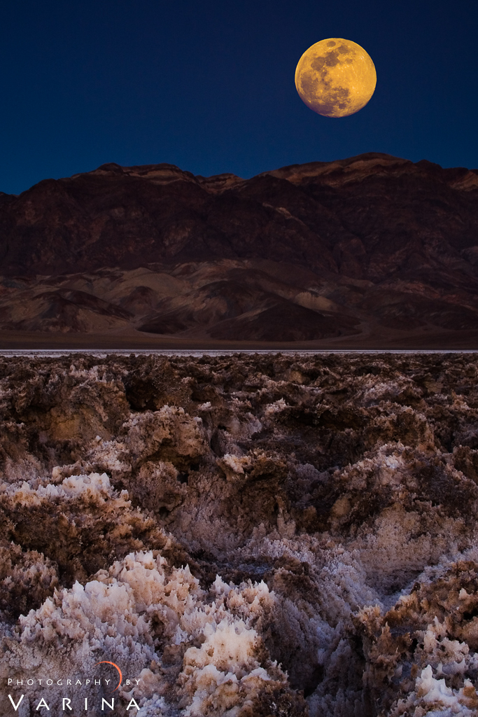
This is a composite shot I took several years ago in Death Valley National Park. I took the first shot with a wide angle lens. Then, I switched to a long lens and photographed the full moon as it rose over the horizon. With a film camera, it could have been done as a double exposure – but with digital, I had to combine the two images in Photoshop.
Here’s how I did it.
Have you ever photographed a landscape with a beautiful full moon? The result is usually pretty disappointing. You might get something like this…
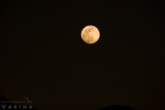
If you choose your exposure for the foreground, the moon will be an over exposed spot in the sky. If you expose properly for the moon, the foreground will be way to dark. Why not combine the two? I took the shot above with a wide angle lens set at 24mm (30 seconds at f/13). Then, I changed lenses and took a second shot with a 75-300mm lens at 300mm (1/160 of a second at f/8).
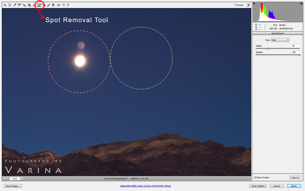
When I returned home, I opened both files in Adobe Camera RAW and adjusted the white balance and contrast. Then, I used the spot removal tool to remove the bright spot of the moon in the original wide-angle image. You could use the clone tool, the healing brush, or content aware to accomplish the same thing. Whatever makes you happy.
Next, I opened both photographs in Photoshop. I selected the moon from the long lens photo using the Rectangular Marquee Tool. Then, I copied and pasted it…
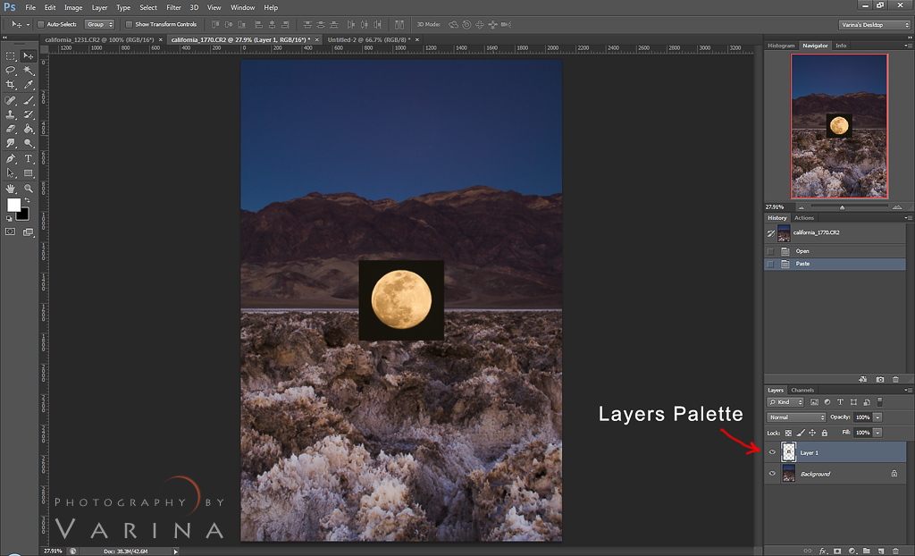
…onto the wide-angle lens file. Here, you can see that the moon appears in the layers palette on top of the original “background” layer.
Next, I used the Transform tool to adjust the size of the moon and to place it where I wanted it in the sky.
I chose to reduce the size of the moon by about a third. It’s really big – but this is art, and I get to do whatever I want! :) Besides, on that particular night, the moon appeared to be much larger and more golden than usual. It’s an optical illusion that you just can’t capture on film… here in the Midwest, we call it a “Harvest Moon.” I chose to move the moon slightly to the right for a more pleasing composition as well. I should mention that I’m using a Wacom Intuos graphics tablet to make all these changes and adjustments. The stylus is much easier to use than a standard mouse, and it means I can work more quickly and much more efficiently.
Then, all I had to do was to get rid of that black square around the moon. I could have used the color selection tool to select the black area and then mask it out – but that’s too much trouble. Instead, I just chose Lighten from the Blending Mode options in the Layers palette.
And voila! The black square was gone and the moon was happily settled in the sky, right where I wanted it. The Lighten blending mode option is pretty cool. It compares each pixel on the selected layer to the corresponding pixel on the layer below. The brighter of the two pixels will be visible, and the darker one will be hidden. In this case, the pixels in the moon are brighter than the blue layer below, so they are visible in the finished image… but the black pixels on the top layer were darker than those on the blue layer, so the blue sky shows through. Pretty cool!
And that’s it! Now, I just flatten and save my finished photo!






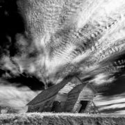

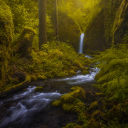

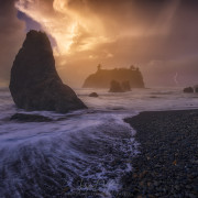


Thank you Varina for this tutorial. I used this technique here.
https://plus.google.com/photos/113967235219638835876/albums/5871539956272706113
Well done, Ratul! Nice shot!
Varina, thank you for this article. I would not have known how to get rid of the black part around the moon. Explaining why the Blending Mode Lighten actually works really helped me understand its use. I always want to understand what the tools do and why so I will know their usage in future photos. Thank you for making it so clear.