Fall Photography: Easy & Effective Post Processing Tips
Photographing fall colors is an exciting time of year for landscape photographers. Fall foliage adds captivating colors throughout the entire day, not just at sunrise and/or sunset. However, fall photography images often fall flat when you see them on your computer screen compared to what you experienced in person. Understanding how to use saturation, vibrance, contrast, texture, clarity, and dehaze in your post-processing will make your autumn colors realistically pop in your fall photography.

Vibrant Fall Colors in Autumn
Focus for Fall Photography
So often with fall photography images, we focus on the leaves. It makes sense that they take the spotlight, but leaves also provide the opportunity for unwanted blur. Leaves take but a simple puff of air to move and are often swaying during your photo shoots.
Therefore, before we jump into the post-processing tips, it is important to be mindful of shutter speeds in the field. Make a conscience choice and decide if the shutter speed is enough to freeze any potential movement, if you are okay with a blur, or if you will need to take multiple exposures and combine the images later in post. Zoom in on your camera’s LCD and review the small details as well as the edges of the composition for proper sharpness. This is the only way to guarantee you have the proper images to create your perfect fall image. Editing sharpness into a blurry image isn’t something you want to make a habit. Now, onto the post-processing!
The Difference in the Basic Panel’s Saturation and Vibrance
One of my first steps in post-processing is to make global adjustments, changes that impact the image as a whole. In the Basic Panel of Adobe Lightroom, the Saturation and Vibrance sliders will apply global changes to your image, but it is important to understand the difference between the two.
Saturation Adjustment in Lightroom
The Saturation slider is a uniform adjustment to the saturation of all colors in your image. It will saturate every color in your photo equally, no matter if it is a highlight, shadow, or midtone, even if some colors are more intense than others straight out of the camera. With fall photography, this choice isn’t always the best route. For example, if a photo starts with only a strong intense red color, the saturation slider may be too strong of an effect. This is because it may push the red to an unrealistic result even though it brings the muted colors to life.


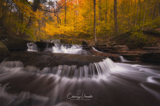
Autumn Waterfall Photography using Long Exposures with Neutral Density Filters

Saturation set to 100%.
Notice how all the reds have been pushed way beyond the point of being realistic.
Vibrance set to 100%.
Notice how it minimally impacts the already bright yellows and orange in the foliage.


Vibrance adjustment in Lightroom
The Vibrance slider is a discriminatory global adjustment tool. It impacts the midtones of the image. Therefore, it will apply more saturation to the subdued or muted colors. Unlike the Saturation slider, the Vibrance slider essentially will ignore already intense colors provided you don’t push that slider to the extreme limit. In the beginning, it pays to experiment with both sliders to see how the colors are altered and which aesthetic you prefer for your editing style.
Utilize the HSL/Color Panel in Adobe Lightroom
Once you have applied any desired global changes to the image through the saturation or variance sliders, the next step is to decide if you want to alter specific colors. A quick and simple way to perform specific color adjustments of your fall photography images is through the HSL/Color panel in Lightroom. HSL stands for Hue, Saturation, and Luminance.
Hue
Often, hue and color are used interchangeably. Hue is shifting the color. For autumn photos, you can take greener colors and shift the hue more towards yellow. In addition, you can shift yellows towards more of an orange.
Saturation
Saturation is the intensity of a color in the image. More muted colors technically will have more grey within the color value. While saturation can really make colors pop, this slider can be used and abused easily. To ensure I don’t go overboard, I will often return to my image after a few hours or the next day to ensure I didn’t introduce too much saturation making the edited photo look unrealistic.
Luminance
Luminance is based on the brightness of a specific color in the image. Reducing the luminance for a particular color will introduce more black and darken those particular pixels. Increasing the luminance will reduce the black, thus brightening that chosen color throughout the photo. Thus, this is a simple way to alter the foliage colors of your autumn images, even the greens.
The beauty of the HSL/Color Panel is that you can choose how you want to edit. In HSL mode, the sliders are first grouped by hue, saturation, and luminance. So HSL will show you hue followed by the separate colors. On the other hand, the Color mode has the hue, saturation, and luminance sliders grouped by color. Therefore, the Color panel option will first group red and hue, saturation, and luminance for the reds only directly underneath it.
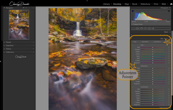
Depiction of HSL Slider, Adjustment Tool, and All Color Option
Employ the Adjustment Point Tool
The Adjustment Pointer is almost hidden in the top left of the HSL Panel. It looks like a circle within a circle. When you hover over it, arrows will appear above and below it. If you are having trouble altering the color of a specific part of your image, this tool will help you target that exact part of the photo.
Simply click on the Adjustment Point Tool to activate it. Next, move your new cursor to the part of the image you want to change. Click and drag the tool up or down to directly change the color of those selected pixels throughout the image. For example, let’s suppose I select the Hue’s Adjustment Pointer and click on a green leaf. When I click, hold, and drag the tool up on that green leaf, it will deepen the green. Conversely, if I drag the tool down after clicking, it will alter the hue from green towards yellow.
Consider Clarity, Texture, and Dehaze for Fall Photography
Most fall photos are captured in overcast light. Once at home in your digital darkroom, they may looked washed out and need an adjustment in the tonal contrast, which is the difference between the brightest and darkest areas of the image.
While the contrast slider exists, it applies global changes to the image. Landscape images tend to require more precision in contrast adjustments. The sharpening slider in the Details panel is another option to adjust contrast. While this is still a global adjustment, it has the ability to be a finer adjustment since it is only adjusting the contrast between each pixel in the image. It is another option to experiment in trying to bring out the details in your image.
To help bring the pop back more selectively, Lightroom’s texture, clarity, and dehaze sliders share a common goal of enhancing or diminishing details and adjusting contrast. This is why they are great post-processing tools to create some autumn splendor.

Long Exposure Fall Photography by Chrissy Donadi
Clarity
Clarity increases and decreases the contrast within the mid-tone areas by increasing the contrast along the edges of the mid-tones. In other words, clarity leaves the highlights and shadows untouched and impacts the remaining areas (mid-tones). This gives the illusion of a sharper image. Generally, clarity decreases color saturation slightly and makes the overall photo appear a little brighter. Generally speaking, clarity is better than texture the image needs a boost in tonal contrast (difference in brightness in different areas of the image).
Texture
Texture is Adobe’s more recent addition. It is designed to impact areas of mid to high frequency areas of contrast. Think of frequency as the edges of details within the image that changes from light to dark. Low frequency is a bright blue sky. High frequency is a cluster of tree branches with bright leaves in the background.
Texture has become a new favorite tool because it can still provide a strong impact without affecting the fine details. Essentially, it is to a less drastic clarity slider. My preference is to typically increase texture in my fall images because it impacts areas that I want to emphasize and doesn’t overly brighten the image. For me, I find it works better than clarity in most cases. Moreover, texture doesn’t significantly shift color or saturation, unlike clarity and dehaze.
Dehaze
Dehaze is intended to add or remove atmospheric haze from an image, such as fog, haze, mist, or smoke. It increases contrast in low frequencies areas and saturates color casts, even in very bright or dark areas. If an image feels washed out, dehaze can be very useful for amplifying contrast and color.

Clarity set to 100%
Notice how the highlights and shadows remain untouched but the mid-tone areas are impacted.
Texture set at 100%.
Notice the changes in the water in the foreground and the rock on the right when compared to clarity.
Dehaze set to 100%.
Here both the darkest and brightest areas are impacted.


As a final piece of advice, always review your post-processing changes zoomed in at 100% as well as zoomed out to fit the entire image on your screen. It is amazing how a change may look great when zoomed out but will show issues when zoomed in or vice versa.
I hope you get out to enjoy the brisk mornings, cooler temperatures, and bright colors this season. Even more, I hope these post-processing tips will help elevate the colors in your fall foliage images. Happy Shooting and Editing!
About Author Chrissy Donadi
Chrissy Donadi is a professional photographer, photo educator, and writer born and raised in Pennsylvania’s Pocono Mountains. She spent many years in the engineering world working long hours and with stressful deadlines. Then a career-based moved to a foreign country pushed her into photography. With no friends or family near or even in the same time zone, Chrissy found herself with a lot of free time, a camera, and some nearby mountains were calling her name. What started as fun weekend excursions quickly developed into a hobby and then spiraled into an intoxicating and blissful obsession. She spent the subsequent years maturing her talents and now works solely as a travel, nature, and landscape photographer. With as much as Chrissy thrives in creating images, she equally enjoys teaching and sharing her passion with others.


