How to choose correct White Balance for Nature Photography
I’ve said it before and I’ll say it again, white balance for nature photography is critically important. White balance can effect both the mood and appearance of an image. The correct white balance contributes to a finished photograph that accurately represents the original scene. The wrong color balance, on the other hand, can leave a photo looking washed out or unnatural. So, how do you select the best white balance for nature photography?

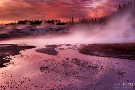
Nature photography from Yellowstone National Park, Wyoming with a strong color cast
While there are tools that can help you get your white balance right – like shooting with a grey card or using software like Color Checker – these tools don’t always work perfectly. There are a lot of situations where these tools just won’t work – when there are different light conditions in different areas of your photograph. For more reliable results, we select the best white balance based upon shooting conditions, our memory of the scene, and the mood we are trying to convey. Of course, white balance is also a personal artistic choice. You can choose a realistic color balance or you can choose something “artsy” in post processing.
Unfortunately, there is no single cookie-cutter approach for selecting the best white balance in nature photography during post processing. The following are two simple steps that will help you get the proper color balance in your nature photos.
Step 1: Pay Attention to Colors and Light Conditions
The first step is the simplest – but many people skip it. While you are photographing, take your eye away from the viewfinder and look around you. Take a moment to look carefully at the colors that are really there. Is the light from the setting sun changing the color of the landscape? Is light reflecting off brilliantly colored clouds and causing a color cast on the ground around you? At first, most nature photographers have a hard time seeing those slight changes, but over time, you can develop your vision so that you notice the colors changing around you.
Try this simple exercise… next time you are out driving just before sunset, wait until the sun is directly over one of your shoulders. Either on your right or on your left. Then, look at the trees, buildings, or other objects on the sides of the road. When the sun is low in the sky, you’ll notice that the objects on one side of the road are painted with light. The objects on the other side are in shadow. Can you see the golden or magenta color cast?


Orange color cast towards the sun – Cannibal Bay, New Zealand

Magenta color cast while looking away from the sun, New Zealand


This is a great comparison for those who haven’t noticed the effect before. When I point this out to new students, they are almost always surprised by it. It’s something they haven’t noticed before. Once you start to notice changing light, see if you can see the color cast that appears on the ground under a brilliant sunset. Look for the glowing golden colors that appear in a forest in the spring… especially on a wet and overcast day. Soon, you’ll be seeing subtle color changes everywhere you go.
Step 2: Adjust White Balance in Post Processing
Ok, so now that you’ve seen the colors… now that you are really noticing them, open up your file in your RAW converter and make the necessary adjustments.
- Start with the default setting based upon the conditions as they were when you took the shot. Was it cloudy? Choose a cloudy setting. But don’t stop there.
- Look at the photo and ask yourself this – Does the white balance look just right? Shift the temperature slider back and forth just a little and watch what happens to your image. Pay attention to subtle color casts that appear as you adjust the slider. You need to decide if those casts are what you want for your image.

Creative nature photography with White Balance Settings – Daylight for Sky, Cloudy for Mountains & Foreground
Unfortunately this is harder than it appears even if you have mastered observing colors in nature. White balance can vary widely between different parts of the scene based on the light conditions. Add to it the fact that white balance can be an artistic choice and subject to the nature photographer’s interpretation. Considering all of that, you can see the complication that arises in selecting the correct white balance.
Let’s look at a couple of examples to see how I deal with these complications.
Realistic White Balance in Nature Photography
I took this shot in New Mexico,at the Bosque del Apache wildlife preserve. The cranes were flying overhead as I set up my tripod but by that time, I’d had my fill of photographing birds. I wanted to capture the beauty of the landscape as high winds and heavy clouds announced a coming storm. I was drawn by the rich orange colors and the complimentary deep blue/grey of the sky. A bit of residual light made it through the clouds on the horizon to my right and behind me which provided a very soft, golden glow on the already colorful landscape.

Processed using Multiple White Balance – Bosque del Apache Wildlife Preserve, New Mexico
I used a graduated neutral density filter to reduce the brightness of the sky. But I also bracketed since my histogram told me that the light areas in between the heavy clouds were still slightly overexposed. Aside from the dynamic range problem for nature photos like this, white balance can be pretty difficult. Because I used a wide angle lens to photograph this, the balance of light is often different from one area to another. In this case, the foreground needed one white balance and the sky needed an entirely different one!

Image #1: White Balance: 7000K for foreground – Bosque del Apache Wildlife Preserve, New Mexico

Image #2: White Balance: 4900K for Sky – Bosque del Apache Wildlife Preserve, New Mexico


Take a look at the small image on the left above (Image #1). The foreground color is just right (at least according to my memory of the scene), but the sky is oddly white. This happens because light is being scattered and reflected differently in the sky than it is on the ground. When I set my color balance for the ground, the sky just looks wrong!
So, I set the color balance in the RAW converter, saved a snapshot, and opened the file in Photoshop. And then I went back to the original RAW file and adjusted the color balance until the sky looked right (Image #2 above) – ignoring the funky colors I created in the foreground – and then I opened the file again. Now I have two images open on my desktop and I can blend them with the help of some Photoshop layers and masks.
The finished nature photo is a better representation of the reality of the scene and the white balance is no longer distracting. There are a lot of steps involved when it comes to capturing a wide-angle shot like this… I know! But it gets easier with practice. I promise! :)
Creating Mood with White Balance
It is well known that colors in nature photography can effect the mood. Blue, for example, is associated with feelings of calm – azure summer skies and deep lakes – and cold – winter scenes of snow and freezing glaciers. Most viewers associate a chilly feeling with an image of ice like the one above. But how many viewers notice the subtle blue color cast?

White balance selected to give blue color cast to ice.
Without a direct comparison, it’s difficult to see the blue cast in this nature photo. Take a look at the image below. You can see that the original image is on the left. On the right, the color cast from the ice is completely removed. Although the texture of the ice is preserved, the chilly feeling is lacking. This subtle change reduces the overall effectiveness of the photo.

Comparison of color cast to create mood for macro photography
During processing, it is important for nature photographers to be aware of slight color casts like this. Think about what you are trying to convey with your image. Do you want your viewer to perceive a sense of calm and cool in your image? Or are you trying to invoke feelings of warmth and comfort?
We always love to hear from you – and we’d love to see what you are doing too. If you are struggling with white balance for nature photography – or if you’ve mastered it – Feel free to leave a comment!
About Author Varina Patel
There is nothing more remarkable to me than the power of nature. It is both cataclysmic and subtle. Slow and continuous erosion by water and wind can create landscapes every bit as astonishing as those shaped by catastrophic events – and minuscule details can be as breathtaking as grand vistas that stretch from one horizon to the other. Nature is incredibly diverse. Burning desert sands and mossy riverbanks… Brilliant sunbeams and fading alpenglow… Silent snowfall and raging summer storms… Each offers a unique opportunity. I am irresistibly drawn to the challenge of finding my next photograph, and mastering the skills required to capture it effectively.


Great article. I will try the blending techniques.
Jay,do you use a handle mounted flash for your day time photos?I have been reading a lot about day time shooting,and some photographers use one (flash) and some do not.I love your work (and your wifes)love your waterfalls the best.Thanks,and keep up the great work and letting us no names about how to shoot;
Hi George,
Thanks for the comment about our work. We don’t use a flash in the field (in fact I dont remember any of landscape photos taken with a flash). We do however use reflectors and diffuse for small subjects and for macro work.