How to build a Photography Composition around your Subject
When teaching photography, I receive more questions about nature photography composition than any other topic. Yet, most students don’t realize their inquiries center on this concept. Many assume that strictly following the rules of composition in nature photography will make their images more appealing. While understanding the rules is crucial, photography is, at its core, an art form. Simply adhering to compositional rules often isn’t enough to create visually impactful nature photographs.
To truly elevate your images, you must find the inherent beauty in a scene and present it in your unique way. The foundation of compelling nature photography compositions lies in building a photograph around your subject in nature photography. Incorporating compositional elements for nature photography can enhance your subject and draw the viewer’s attention. Below are key compositional techniques to help you create stunning images.
Using Natural Leading Lines in Nature Photography
When planning a nature photography composition, I constantly think about leading the viewer’s eye. How can I ensure the most crucial elements stand out? How can I prevent the viewer’s gaze from wandering aimlessly within the frame?
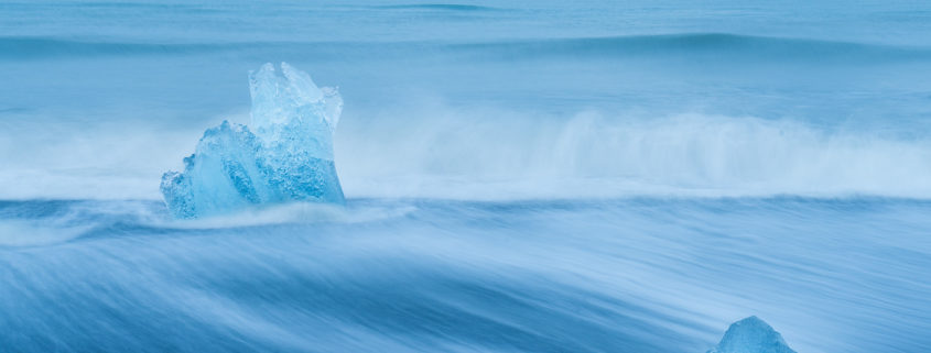
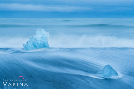
Leading lines in nature photography are powerful tools to guide the viewer’s eye. For example, in the image below, I used a slow shutter speed to emphasize the water’s flow, creating natural leading lines that direct the viewer’s focus through the photograph.
Leading lines can be found in many natural elements, such as rivers, tree trunks, mountain ridges, or trails. Incorporating these into your composition will help create depth and visual interest.
Selective Focus for Nature Photography Composition
Another way to emphasize your subject is by using selective focus in nature photography. By isolating your subject with a narrow depth of field (DOF), you can blur distracting elements in the background, allowing your subject to shine.
In this image of a hanging flower from Costa Rica (Image #1), I used selective focus and narrow DOF to direct attention. The smooth background lacks details, naturally encouraging the viewer’s eye to rest on the flower. Your eyes wants to focus on something sharp and familiar – that’s what they do all day long, every day. It comes naturally to us – and I can use that basic human instinct to direct your attention where I want it. In contrast, a wider DOF (narrow aperture) revealed distracting details in the background (Image #2), reducing the image’s visual impact.
This technique is especially effective in macro photography composition and when isolating small subjects in busy environments.
Using Color to Create Contrast in Nature Photography
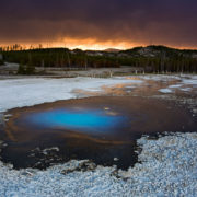
Color contrast in nature photography is another critical element to enhance your compositions. For example, in a photo taken by Jay in Yellowstone National Park, vibrant magenta flowers in the foreground stand out dramatically against the surrounding green foliage. Everything else in the image surrounding the magenta flower is green, so the small magenta flower stands out because it is different.
Colors in nature photography not only define mood but are influenced by light, weather, and post-processing. Using complementary colors in nature photography can create striking images that immediately capture attention. Experiment with contrasting hues like blue and orange or green and red to make your subjects pop.
Size Contrast in Nature Photography
Size contrast in nature photography is another technique to create impact. By juxtaposing large and small elements, you can emphasize your subject and add depth.
For instance, in a photograph from Death Valley National Park, the largest and brightest salt crystal commands attention. Though another large crystal is present, it remains unnoticed because it lacks the same tonal contrast and sharpness. Our minds are wired to notice differences and similarities in everything we see – we are masters at categorization. I deliberately chose this nature photography composition to include just one larger crystal.
But wait… there is actually another large crystal in this shot, but people rarely notice it unless they are looking carefully. Why not? It’s not as bright or as well-defined as the other large crystal at the bottom left. So, the largest and the brightest gets the most attention in nature photography composition. I reason I can get away by adding that other large crystal in my shot is because it didn’t have the same visual impact as the one I chose as the point of interest.
Contrast of Form & Textures in Nature Photography
Texture and form in nature photography composition play a vital role in creating compelling images. Contrasts in textures or forms naturally draw the viewer’s eye.
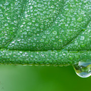
In a monochromatic macro photo of a rose, for example, a single water droplet stands out due to its defined structure and contrast with the surrounding soft petals. Similarly, in a landscape shot from Grand Staircase Escalante Monument in Utah, the smooth curve of a small hoodoos breaks the striped mountain patterns, becoming an immediate focal point.
As you may have guessed, creating impact with form and textures in nature photography also involves contrast. But this time, we’re talking about contrast of form. Monochromatic or Black and White nature photography present some of the best examples to highlight the contrast of the form and textures.
Your Turn: Apply These Nature Photography Tips
Next time you’re in the field, consider these nature photography composition tips:
- Use leading lines in landscape photography to guide the eye.
- Experiment with selective focus to isolate your subject.
- Play with color contrast in nature photography to add vibrancy.
- Explore size and tonal contrast to create depth and emphasis.
- Highlight textures and patterns to build visual intrigue.
Remember, nature photography composition isn’t just about what’s in your frame—it’s about what you exclude as well. The best photographers are intentional about every element in their image.


