Essential Principles of Color Theory for Nature Photography
Color can create tremendous impact in your photographs. Understanding color theory can help nature photographers to use color to their benefit to create stronger images. Used by painters, photographers, interior decorators, graphic designers and others, color theory is an essential part of a creative’s toolkit. Color theory is based on the color wheel. Many of you may remember studying the color wheel in elementary school. Yes, it’s the same color wheel you studied many years ago. The color wheel will help us understand the relationship between colors in nature photography.
Primary, Secondary and Tertiary Colors
Red, blue and yellow are primary colors. They are pure colors and are not created by combining other colors. In between the primary colors and the secondary colors, produced by mixing equal amounts of the two primaries. Orange is created by mixing red and yellow; green is created by mixing blue and yellow; and violet is created by mixing blue and red. Tertiary colors are a combination of a primary color and a secondary color, i.e. red and violet will make red-violet or blue and green will make turquoise. I found that revisiting the color wheel brought back memories of that beloved box of 64 colors of Crayola crayons and a fascination with the many colors and the names they were given.


Color Wheel with Primary, Secondary and Tertiary Colors

Color wheel showing variation of light tones by Anne Belmont


Tints, Tones and Shades
Some color wheels will also show variations of the pure color. Moving toward the white center of the wheel (pictured above), they will show tints of the pure color. A tint means that white has been added. Tints tend to be more subtle. Tones indicate that grey has been added. Shades are achieved by adding black to the pure color. The effect of color in an image is not just the color itself, but also the tints, shades and tones and how we react to them.
Let’s get a little deeper into how colors work together and how we can use that understanding to create more impact for nature photography.
Analogous Colors
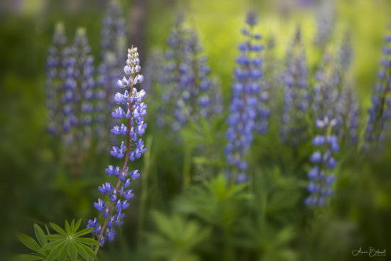
Colors next to each other on the color wheel are called analogous and harmonize with each other. For example, red, red-orange and orange are analogous, as are blues and greens. Harmonious colors can be very pleasing to the eye in their subtle differences. Nature photographers can often use these properties of analogous colors to create a calming effect. The tulip image below is harmonious with its warm tones of red-orange, orange and yellow, while the purples and greens together in the lupine field work well together to create a restful harmonious combination with their cool receding colors.


A tulip with analogous colors – Red-Orange, Orange and Yellow

Analogous colors purple and green of the lupine field create a restful, harmonious combination with cool receding colors


Complimentary Colors
Colors directly opposite each other on the color wheel are complimentary. Red is complimentary to green, blue to orange and yellow to purple. They are complimentary because they do not contain any of the color opposite them. Red contains no green and vice versa. Using complementary colors in your images can create impact. Simply put, these colors just look good together. The contrast and visual tension created by complimentary colors catches the eye. For example, the red dahlia below is much more lively with its green complimentary background. The dahlia was shot at an indoor dahlia show and the background was originally white, the result of a table in the background. The image was unexciting and flat. I chose a green texture to add to the background, layering it in in Photoshop and creating a mask to paint the flower through. Suddenly the flower came alive, a very different image with more impact. The petals of the blue-violet crocus contrast beautifully with the complimentary yellow-orange stamens within the flower.


Complimentary Colors of Red and Green Create Impact


Complimentary Colors in a Crocus – Blue-Violet Petals and the Yellow-Orange Stamens


Triadic Colors
Triadic colors are composed of any three colors that are equally spaced on the color wheel, as to form a triangle, such as red, yellow and blue, or purple, orange and green. Using triadic colors can be vibrant and rich, but they may be hard to find in nature. To use them effectively in nature photography you might want to choose one as the dominant color and the other two as accents so as not to overwhelm each other.


Triadic Colors – Orange, Green and Purple. Orange is the Dominant Color.

Monochromatic Colors Are One Hue of Different Tints, Tones and Shades


Monochromatic Colors
Monochromatic colors take one hue and use different tints, tones and shades of that hue. Many people confuse monochrome with black and white, but monochrome simply refers to using colors that are of the same color value.
Dominant & Recessive Colors
Reds and oranges are warm, dominant colors and blues and greens are cool receding, colors. For nature photography it works well to have a dominant red flower with a green background as we saw with the dahlia image above, but it generally does not work to have a green plant with a red background. The background with dominant colors would distract the viewer from the main subject and cause visual conflict. Nature photographers can create impact and add depth to their images by combining dominant and receding colors in a thoughtful way.
Color, Emotion & Nature Photography
Color can have emotional meanings for the viewer, as well, and we all have color preferences. Color will often stimulate emotional responses and color can take on different meanings in different cultures. We associate reds with love, passion, power, leadership and energy, but also anger and danger. Red is a dominant color that will grab the viewer’s eye, so it’s important to think about where you want to place it in your composition. When photographing red, you will want to underexpose by -1 to ensure a rich, vibrant and correctly exposed red. Orange is a color associated with health and vitality. Like red it is a dominant, advancing color and is best underexposed by -1. Yellows are uplifting, cheerful and vibrant. Yellow is the brightest color on the spectrum and when photographing yellow we will often need to overexpose +1.

Red is a Dominant Color Often Associated with Love, Passion and Energy
Green is associated with youth, hope and freshness. Green is a recessive color and has a calming effect. It is a great background color and is luckily one that is abundant in nature. Blue is also a recessive color, and suggests tranquility, peace, calm, dependability and coolness. It is the most popular color worldwide and also abundant in nature. Like green, blue is a recessive color, and also a great background color. Violet, or purple, is a combination of red and blue. It is a color associated with royalty, leadership and spirituality. If you are filling the frame with a deeper violet, as in the image of the tulip below, underexpose -1.

Filling the Frame with This Deep Violet Tulip, I Needed to Underexpose my Image -1 to get the color correct.
Not to be forgotten – white and black. White is a symbol of hope and purity and because of its lightness, it is an advancing color, grabbing the eye and pulling it into the frame. Black is the most recessive color, the absence of color. It denotes mystery, elegance, power and is often associated with evil, danger or depression. Black will provide contrast and cause other colors to take center stage.
Why Do We Underexpose or Overexpose?
Above I mentioned underexposing or overexposing certain colors. Why do we need to underexpose or overexpose our camera’s light meter with particular colors? Remember that your camera’s light meter is programed to expose all reflected light as if it were a neutral 18% gray, thus necessitating a bit of readjusting to get accurate color. It is why when we shoot white subjects we must usually set a +1 exposure, and with black subjects, at least -1. Luckily we don’t live in a world of gray as the camera’s meter sees it.
Color can also be the subject of your photograph. As with all abstract elements, challenge yourself to see your subjects in terms of color, lines, curves, patterns, textures and shapes and make that a part of the story you tell. The image of the tulip below is more about the vibrant colors than about the flower itself. Learn to think abstractly.

Same Tulip as Above, but This More Abstract Image is All About Color and Less About the Tulip
Everyone has color preferences and you may find yourself gravitating to certain colors to photograph. Do you prefer warm or cool colors? Do you find yourself drawn to vibrant colors or more subdued tones? Understanding the impact color can have will help you add a new dimension to composing your images in nature photography. In closing, remember that all “rules” are just tools in our creative toolkit to help us create better photographs. Rules can be broken, and ultimately the decisions you make about color and how you compose them in your viewfinder have to be intuitive ones that feel right to you. Use this knowledge to help you understand the impact color can have and to further understand how you see the world and translate it to your photographs.
About Author Anne Belmont
As a nature photographer specializing in flower photography, Anne’s passion lies in capturing the beauty of flowers and other botanical subjects up-close. It is the small, often unnoticed details that draw Anne to her subjects. It is her belief that if we slow down and look at nature in a more contemplative way, we will find subjects that convey impact and emotion, causing the eye to linger a little longer. A life-long involvement in the arts and a first career as an art therapist have shaped the way that she views art and the creative process and have reinforced her belief in the healing power of both art and nature in our lives.


