How to Effectively Use Colors in Nature Photography
In my previous articles, I talked about composition used as a storytelling tool and when to break well established composition rules to make your message more impactful. The next step towards photographic nirvana is mastering colors in nature photography as a compositional tool to add to your tool set.
When it comes to colors, no tool is as indispensable as the Color Wheel. Study the color wheel, learn it, make it second nature. Unless you shoot black and white, the color wheel will accompany you everywhere in your photography.
It’s well known in color science that humans react positively when colors are arranged in certain patterns. I’m not going to dig into the gritty details of the whys and hows. I will only mention that the these patterns are very easy to visualize in the color wheel.
Complementary Colors
Probably the most famous and sought after arrangement of colors is complementary colors. Two colors are called complementary when, on the color wheel, they sit opposite of each other. Complementary colors call for contrast, dynamism, and pop.
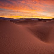
Golden Wave shows how choosing complementary colors for the sand and the sky reinforces the use of an S curve in a strong, almost graphic, composition. The two compositional tools (complementary colors and S-curve) work together to create dynamism. The dune pops out of the sky and brings the viewer straight to the storm forming in the distance.
Triad
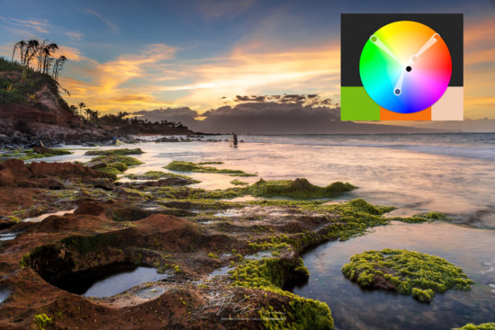
A triad color arrangement traditionally uses three hues that are evenly spaced around the color wheel. The goal of using a triad is to create a set of hues that brings a sense of order and balance to an image.
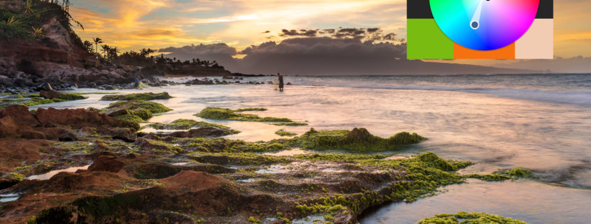
In Fishing in Maui, I was after the feelings of calm and peace, a fisherman occupied in a serene environment. Choosing a triad of blue, orange, and green hues – respectively top left, bottom left, and bottom right – gives harmony to the composition, strengthening the message behind it.
Analogous Colors
Analogous colors are used to focus the composition on structure and texture to tell your story, instead of colors. Colors receive a supporting role rather than being the leading actor.
In Akaka Falls, the story revolves around the iconic tropical feeling of this beautiful falls and nothing evokes the concept of tropical like shades of greens.
Pastel Colors
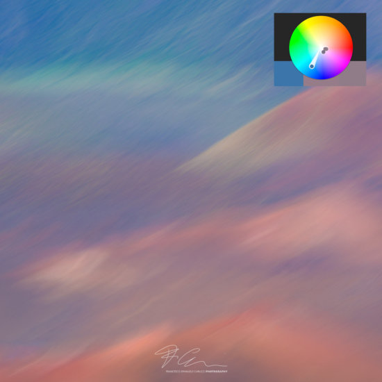
Pastel colors are not technically an arrangement of colors, but they are still easy to visualize in the color wheel. They cluster around the center of the wheel. I like to use pastel colors when I’m after intimate images with a strong “painterly look”. Pastel colors work exceptionally well on abstract and intimate landscapes.
Haleakala Impressions is a good example of using several color composition techniques at the same time. On one side the pastel colors are clustered around a set of analogous hues with a dominant hue (blue) at around ninety degrees of the cluster to give separation between the two elements of a diagonal abstract composition. Together they give strength to an image that looks a lot like a painting more than a photography.
Let us know in the comments how you like to use colors to tell your story.

