5 Color Management Tips for Landscape Photographers
Color management is often viewed as black art, relegated to just the professional realm of fine art nature photography. When we start talking about color management in landscape photography, we get lots of questions and confused looks from our students. One of the most common questions that we get from our students is: “How are we able to capture landscape photos with such vibrant colors?” Most students assume that we use some sort of filter or special Photoshop technique to get our results. But the reality is that we don’t. We use a complete color management workflow which starts when we are capturing landscape photos in the field and continues to our post-processing in Photoshop. This color management workflow in Photoshop will help you produce rich vibrant colors that you experience in nature. And it is a key step in post processing if you are looking to share your landscape photos with stunning vibrant colors on social media.
Here are few color management tips to produce stunning landscape photos with vibrant true to life colors.
#1: Calibrate your Monitor Regularly
We have all heard that monitor color calibration is an essential starting point for color management, but not many photographers calibrate their monitors on regular basis. Here are two of the most popular reasons we hear as to why nature photographers don’t calibrate their monitors:
- Some landscape photographers assume that a good quality monitor is automatically calibrated right out of the box. However, this is not always the case. Some monitors have calibration software build into them, but most do not.
- Another popular excuse for not calibrating your display or LCD is that you can hardly see a difference between a calibrated and uncalibrated monitor. Sometimes the difference is rather minor, but other times the difference can produce dramatic results.
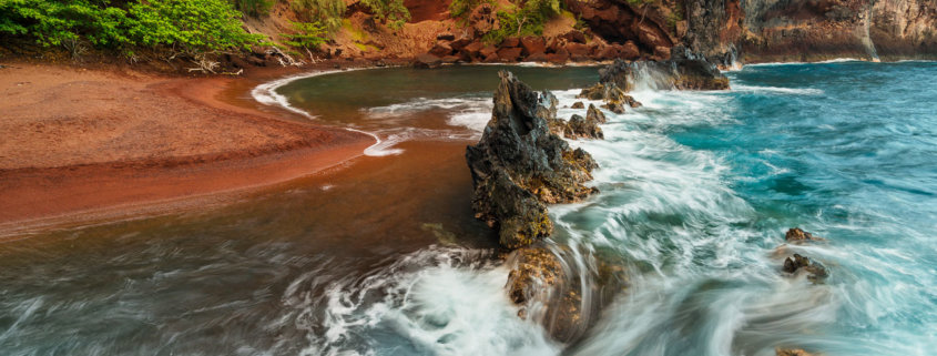
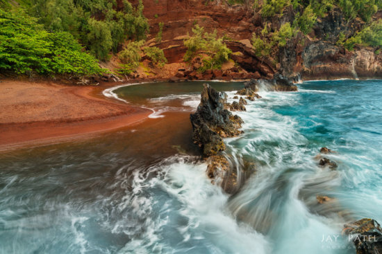
The first image above was processed using a uncalibrated monitor whose brightness was turned up high because it was located in a bright room with lots of windows. Everything in the photo looks great when viewed on this monitor. However, if you were to share this image on social media and view it in a normally-lit environment on a calibrated monitor, the photo will look under-exposed and poorly processed as seen in image #2.
You can see that a monitor or LCD calibration is essential even if you are just going to share your photos on social media. One popular myth is that monitor calibration can be performed either by software programs and that you don’t need a calibration device like Datacolor’s Sypder or X-Rite’s iStudio. As a pro landscape photographer I can tell you that this is NOT correct. While is true some high end monitors have calibration algorithms built into them, for most monitors you will need a dedicated calibration device to accurately calibrate a LCD or a monitor. We use X-Rite i1Studio or i1Display Pro devices to calibrate display and LCD on our laptop computers.
#2: Learn to use Color Space properly
Once you have calibrated your monitor, another good color management practice is knowing how to set up up your post-processing software such as Photoshop and Lightroom to use the correct color space. Using the wrong color space makes your photos look flat or they may not be able to display the rich colors that you can see in nature. While processing our images in Photoshop, we set our working color space to either Adobe RGB or ProPhoto RGB. These color spaces combined with a 16-bit post processing workflow gives us the vibrant colors with smooth gradation throughout our landscape photo.
However, when we share photos, we convert the photos to sRGB color space because most devices are unable to handle wide colors spaces. By converting a landscape photo to sRGB we can ensure that photo will look consistent when viewed on different smartphones, laptops and other calibrated screens.
A landscape photo with Pro RGB or Adobe RGB color space will look rather dull and unappealing when viewed on a calibrated monitor that supports only a narrow sRGB color space. The first of the two images above shows a photo processed in Pro when viewed in sRGB. The same photo (Image #2) when converted to sRGB retains its vibrant colors across the devices that can view only sRGB photos.
#3: Use correct background for accurate colors and luminosity
A good color management practice requires the awareness that your background colors and luminosity impact how your image appears. Consider a simple example of two grey circles on black and white backgrounds.
In Image #1 above, the grey circle to the right appears to be darker then the the one on the left because it is being viewed against a lighter background. When we move the circles closer together, you can see that the luminosity of both the circles is exactly the same.
The similar effects also occur with ambient lighting in the room where you are post processing your landscape photos. If you are processing an image late at night in a dark room on your properly calibrated monitor or LCD, your images will look exceptionally bright and colorful even if they are dark or under-exposed. Similarly the color of ambient light in the room will impact the colors in your landscape photos. We always use daylight balanced light when we are processing our photos. You should process the images in a controlled lighting environment using a neutral dark grey background.
#4: Avoid Making Extreme Exposure Adjustments
Good color management in landscape photography starts with excellent field work.
I know what you are thinking…”Isn’t color management all about getting the colors in post-processing correct?”. Technically that is correct, but colors in post-processing are impacted by how much camera exposure and contrast corrections you make. For example, if you make extreme camera exposure corrections to a poorly exposed photo, you may introduce banding and noise. For this reason, it is important to understand how natural factors like weather, light, seasons, and time of the day impact the colors in landscape photography. It’s also important to know to use your camera’s exposure settings to capture all relevant data.
Mesa Arch created using Bracketing and Blending
Mesa Arch created single exposure pushed to 4-Stop
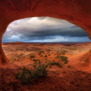
For example, if you are facing a situation like the one you see in the Mesa Arch photo above from Canyonlands National Park (where you are dealing with extreme range of light), it is important to know how to bracket your photo. You can then use proper colors space in Photoshop and a calibrated monitor to produce a landscape photo with stunning details and rich colors that you find in nature.
#5: Know how Contrast and Exposure Impact Colors
While this topic does not directly relate to color management, it is important to understand how color management settings impact how much adjustment your landscape photograph can tolerate.
Contrast and colors are intricately linked. An image with great contrast, in most cases, appears more colorful then the one with lower contrast. However, increasing contrast may push one or more color channels to lose details by clipping the color channel. This is especially possible if you are working with a narrow color space like sRGB. For this reason, we always use a wide color space such as ProPhoto RGB or Adobe RGB during post-processing. We also keep an eye on our histogram when we adjust contrast of our landscape photos to ensure that one or more color channels are not clipped.
So, the next time you sit down to process your photos on an uncalibrated monitor or take an attitude of I will fix it later in Photoshop, think about taking some time to calibrate your monitor and/or getting it right in-camera. A sound color management workflow will make your nature photos look brilliant across all devices.


