
A Simple Lightroom Workflow For Colorful Images

Sunset over Hydra Island, Greece
Someone recently asked me the following question:
I have at my disposal Lightroom, Photoshop, ON1 for all post-processing, but somehow I am unable to bring out the colours in my landscape images.
Since I get similar questions all the time, I wanted to introduce a very basic workflow that enables anyone to enhance the colors of a landscape photo without spending a lot of time… provided they pay attention when taking the exposure.
By following this process, you can quickly obtain a pleasant image that might be refined further, if you want, but is already at a good starting point.
But first let’s lay down some ground rules.
In the Field
Shoot at the Golden Hour
Let’s face it… no amount of processing skills accomplish nice, deep, and most of all natural colors out of an image that was taken at high noon, under clear skies. There are exceptions to this rule, like there are to any rule, but photographing when the light is great makes everything so much simpler.
Do Not Blow the Highlights
Need I say more?
Shoot RAW
Shooting RAW lets you process an image without degrading it. It also ensures you are not throwing away any of the information that was captured by the camera. Again, there are exceptions to this. When the light is perfect, you can shoot JPEG and choose a camera profile that is suited to getting those nice colors. I love using the Velvia preset on my Fujifilm cameras; it gives me those warm and rich tones, for example. But that just means leaving all the processing decisions to the camera.
Always Bracket
Memory is cheap and there is no reason not to use the auto-exposure bracket of your camera, if it has it. If I’m shooting static subjects, I do it all the time. I can then choose to use only one of the images in the bracket, do an HDR or otherwise blend them, but I like having the option.
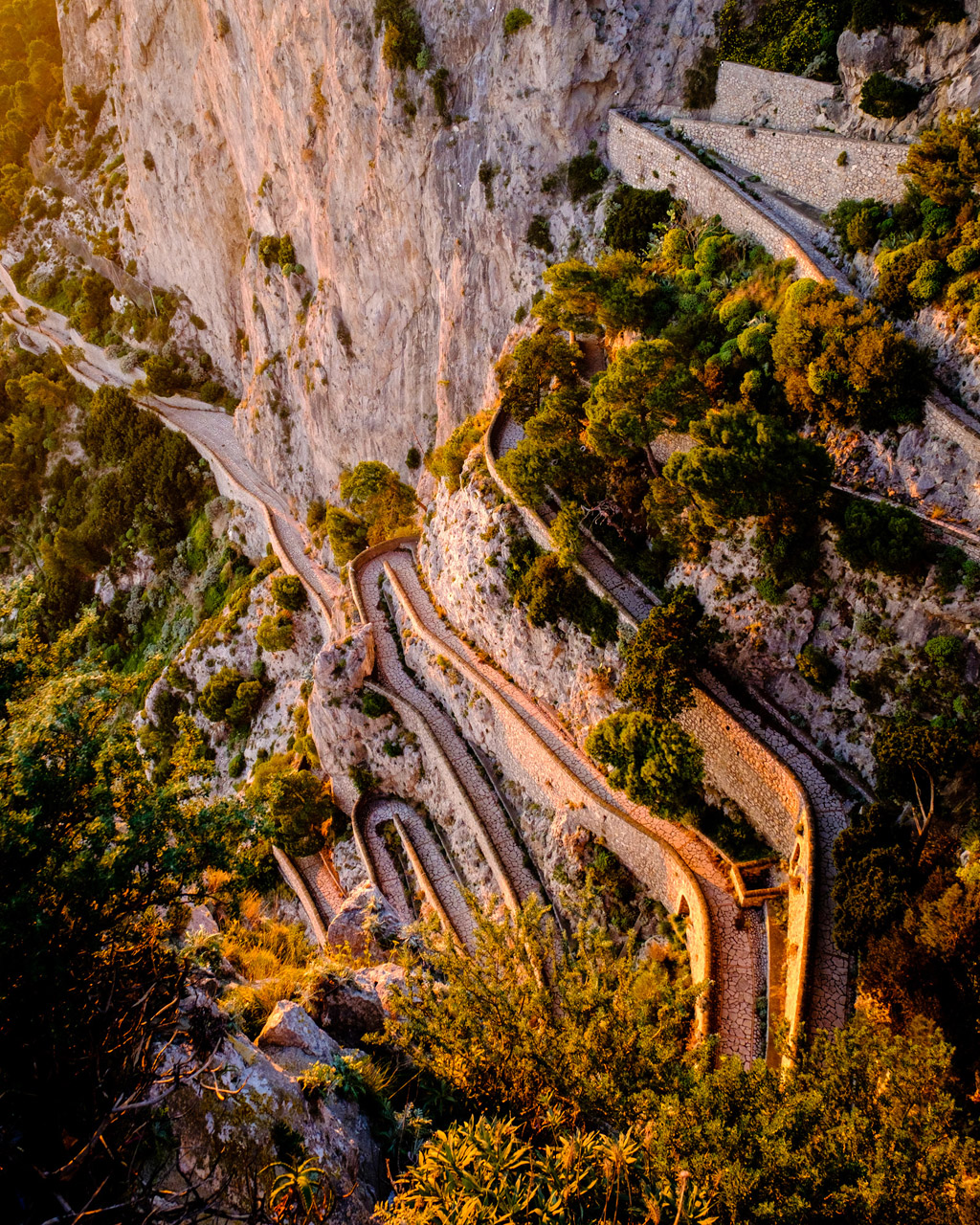
Via Krupp, Capri, Italy
My Lightroom Workflow
Importing
When I import a RAW file in Lightroom, it invariably looks flat and the colors are washed out. This is due to the fact that Lightroom, by default, interprets the file using its built-in Adobe Standard camera calibration profile; it’s designed to behave like this. You don’t have to stick to that! Go to the Develop module and scroll to the bottom of the panel on the right side of the screen; then click the Camera Calibration tab, where you’ll find, depending on your camera, other profiles.
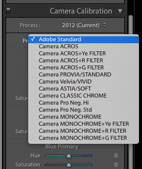
Lightroom Camera Calibration Profile
With Fujifilm cameras, I get profiles that match the in-camera film simulation profiles. I can switch to Camera Velvia/VIVID and immediately get a more colorful image. With different camera brands, you might have profiles like VIVID or LANDSCAPE. Try them out and see which ones work best.
If I shot a bracket, at this point I select for processing the brightest image that has no blown highlights. Alternatively, I might choose to merge them all to HDR.
Temperature and Tint
Right after importing, I tweak Temperature and Tint, if necessary. I do this before anything else because the effect of the other sliders changes depending on the color temperature of the image. This can be a coarse setting that can be refined later, but it sets the mood of the image, i.e. is it warm or cold?
Blacks and Whites
This is arguably the most important pair of sliders you have to tune in order to get a properly-balanced range of tones in your image. I recommend operating both sliders while keeping the Alt/Option key depressed, as this will reveal only the parts that are completely black or completely white. Move the Blacks slider to the left and the Whites slider to the right until you start seeing some black or white pixels. This will ensure you are using the whole range of tones.
Exposure, Highlights, and Shadows
Use the Exposure slider to make your image brighter or darker, as needed. Keep in mind that a darker image generally appears more saturated. Use the Highlights and Shadows sliders to recover detail in bright areas, like the sky, and in the shadows, respectively.
Vibrance
If your image still lacks saturation at this point, use the Vibrance slider to add some color. Do not use the Saturation slider, unless you feel it’s absolutely necessary.
Contrast, Clarity, and Tone Curve
I seldom feel the need to touch the Contrast slider, as it’s too blunt an instrument compared to the ones I have previously tweaked. I might use the Tone Curve tool, if I feel I need a bit more contrast, typically by selecting the Medium Contrast Curve preset. With natural landscapes, I use Clarity sparingly, as it tends to make images too “crunchy”, but I often use it more with cityscape and architecture shots.
That’s pretty much it. For the sake of example, here’s a before-and-after pair of images and the settings I have changed:
- Camera Calibration Profile: Camera Velvia/VIVID
- Temperature: 5030
- Tint: +18
- Exposure: +0.95
- Contrast: +24
- Highlights: -67
- Shadows: +18
- Whites: +24
- Blacks: -59
- Clarity: +30
- Vibrance: +25
- Saturation: 0
- Tone Curve: Medium Contrast Curve

Before & After: Lightroom Workflow
Here is a more dramatic example. In this case, as I always do when I shoot against the sun, I underexposed and bracketed the shot. I combined the three resulting images (at 0, -1EV, and +1EV) into a single DNG 32-bit HDR image using Lightroom’s built-in Photo Merge feature and then applied the following settings:
- Camera Calibration Profile: Camera Velvia/VIVID
- Temperature: 5882
- Tint: +14
- Exposure: +0.15
- Highlights: -100
- Shadows: +83
- Whites: +15
- Blacks: -28
- Clarity: +28
- Vibrance: +30
- Saturation: +1
- Tone Curve: Medium Contrast Curve

Before & After: Lightroom Workflow
As you can see, the values are very much different from the ones applied to the image above, which makes sense, since every image is different and there is no recipe that is good for all images. However, the general workflow is exactly the same. Feel free to share your own Lightroom Workflow in the comments below.
Addendum: some people have asked me whether it’s possible to replicate the same results in Photoshop. Aside from the HDR process, which is a bit different, all the adjustments I have shown that are done in the right-hand panel of the Develop module of Lightroom are performed by Adobe Camera RAW, which is the same used by Photoshop. Here’s a screenshot of the ACR interface that pops up when you open a RAW file from Photoshop and where I replicated the exact same settings I have used in Lightroom.

Adobe Camera RAW dialog
About Author Ugo Cei
Ugo Cei is a fine-art travel and landscape photographer from Italy. If you were to ask him what he does, he would say that he is an educator who helps photography enthusiasts sharpen their skills, so that they can take amazing pictures.
He does this in various ways. First of all, by providing a wealth of free content here on Visual Wilderness and on his own website.
He leads photography tours and workshops to some cool destinations, including Scotland, Venice, Cappadocia, Oman, Greece, Kenya, and others.
He co-hosts and publishes a weekly podcast about travel photography, The Traveling Image Makers. Every week, they pick the brains of famous and not-so-famous travel photographers to learn what it means to travel for the love of photography and photograph for the love of travel.


“Always bracket” …As a Nikon shooter, I narrowed that general rule down to “only bracket when absolutely necessary” many years ago. ;-)
Unfortunately also as a Nikon shooter, I have not been able to recommend the Adobe profiles in a few years. Ever since the D810 came out I’ve begun noticing truly nasty posterization revealing itself with anything close to severe dynamic range editing, posterization that is simply not present when achieving the same punchy results with Adobe’s standard profile and other tweaks.
I solved that problem by dumping Lightroom for Capture One. Now my images look amazingly vibrant and colorful even with zero editing whatsoever. :-)