Using Colors to Create Depth & Direction
By now, most of us know the default rules for composition. Leading-lines, thirds, staggered elements, etc. These things help aid in creating a compelling composition. Take leading-lines for example. We use leading-lines to guide the viewer’s eye from the foreground to the background in an image. Using an S-curve as a leading-line is often desired because the curve of the S takes longer to get from the front to the back than a straight line would, which keeps the viewer’s attention longer.
But what happens when there are no leading-lines available or we don’t have various elements to stagger throughout the foreground, mid-ground, and background to guide the eye through the scene? This is when I like to use contrasting colors and shifts in brightness to give some direction and flow through the composition.
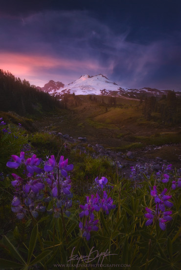
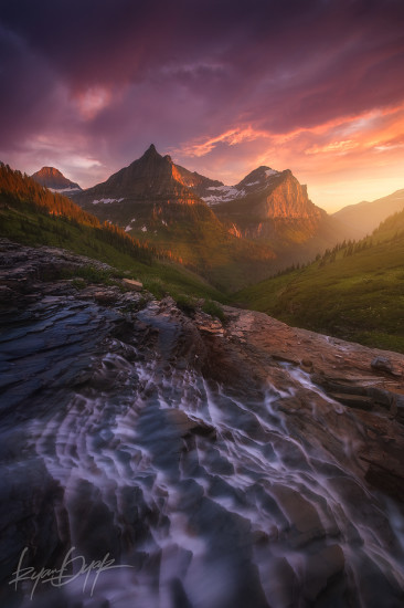
In the photo above, you can clearly see there are really no strong leading-lines or staggered elements in the composition… nothing manually guiding our eyes through the scene. Yet the flow through the image is still taking us from the foreground, through the mid-ground, and into the background. To help achieve this flow, I spent time making the foreground relatively dark and cool (cool as in white balance, not “wearing sunglasses at night” cool) while giving the background some extra brightness and warmth with a bit of color-dodging.
The eye naturally likes to travel from cool dark places into bright and warm places. Knowing when to accentuate this type of color contrast can give you an added advantage in developing compositions when the obvious things like leading-lines are unavailable.
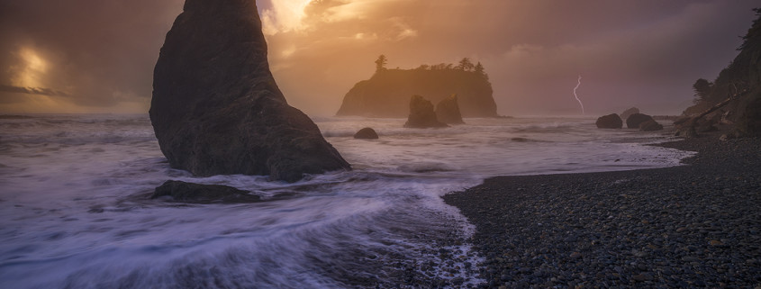
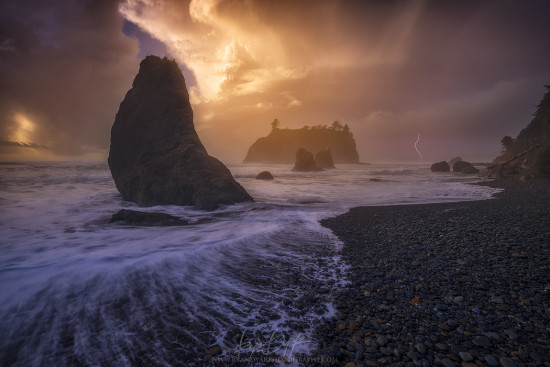
Here’s another example. The RAW file of this stormy scene actually had the foreground water picking up a lot of the warm light from the sky above. Having the water that warm in the photo left it looking just a bit dull and flat overall. By adjusting the foreground to be significantly cooler than the bright and warm background allowed some depth to come out that wasn’t there before.
Doing these types of contrasting colors, brightness, and white balances shouldn’t only be used as a backup option for lackluster compositions. This can be done for many different scenes to give added dimension and flow to compositions that already have strong leading-lines and direction. Imagine if the photo above had warmer colored water… much of the depth in that shot would be gone even if the composition still worked to guide our eye.
So, the next time you’re struggling to find anything in a composition to lead the viewer though the scene or if you’re just looking to give some added depth, consider this type of color contrast work.






Beautiful pictures and beautifully explained! Thanks for sharing.