Selecting Images for Display
For the past couple of year’s, we’ve had a collection of our images hanging in our local fitness center. A long corridor connects the gym to the front desk area, and all that concrete block leaves plenty of space for some big prints. Now, we’re preparing another collection of images for a new display in the same corridor. Planning and preparing a collection of prints takes time, but getting your work out there is good for business – and it can be a lot of fun to see your work on display.
Be sure to visit the space before you select your images. Pay attention to the light, the colors in the space, and the material the walls are made of. You’ll want to choose images that compliment the space, and you’ll need to think about how you’ll hang your prints as well.
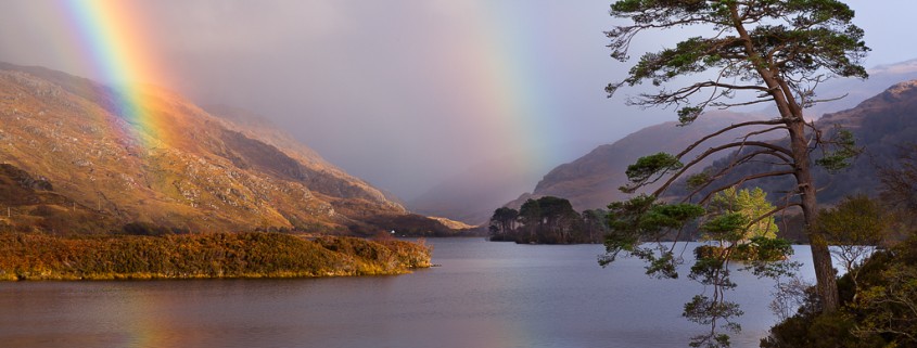
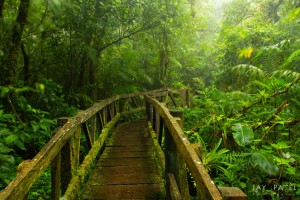
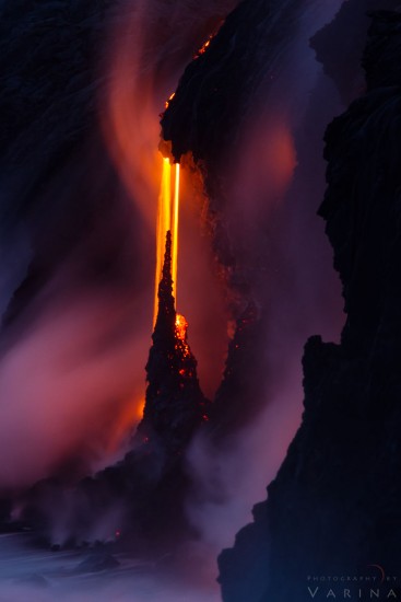
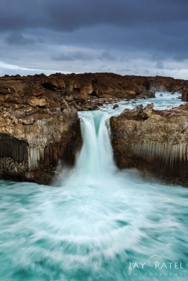
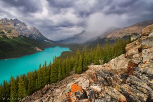
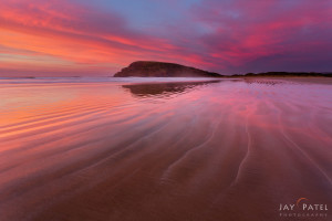
The images you choose should compliment each other, as well as the space you are working with. For our first collection, Jay and I chose images from National Parks across the US. This time, we’ll be displaying images from around the world. We’ve chosen images from six different countries, and each is a wide-angle shot with lots of color and detail.
It’s also really important to pay attention to color. We’ve chosen a series of shots with a variety of bright colors. The corridor where our works will hang doesn’t have a lot of natural light, and the colors are muted. So, splashing some color on the walls will help to brighten it up, and won’t overwhelm the space. We were careful to make sure the images we chose work well together. No single image should take center stage, and each should add something important to the collection.
And finally, consider your printing options. Once again, the space you’re working in really matters. Because of the dull colors and the lack of great light, we’ve decided to order metallic prints for this display. The brilliant colors in the images will really pop on metallic paper, and the display will help to brighten an otherwise uninteresting hallway.



Hi,
I do always like to read all the articles. I like this one too. But as an Interior designer and a landscape photographer, I was expecting more from this. You have explained shortly about what the space has light. In which you can add more as the available light and the frame can transform the space into different world.