How To Make Your Photos “Pop”
Sometimes, after I’ve done a lot of work on an image in Photoshop, I find that the image still seems a little flat. When this happens, I frequently use a simple sharpening technique to help make an image “pop.”
If you want to attempt this yourself, you should first merge all of the layers in your image into a single layer above all the others. You can do this by selecting the very top layer and then hitting Ctrl+Alt+Shift+E (Cmd+Opt+Shift+E on a Mac). This new layer will allow you to mask out the sharpening effect in some parts of the image if necessary, or change the opacity to reduce the strength of the effect. It also allows you to delete the layer later if you decide you don’t like the effect.
With the new, top layer selected, you can now use the Unsharp Mask filter, which can be accessed in Photoshop by going to Filter > Sharpen > Unsharp Mask. The settings I normally use are:
- Amount: 5%-30%
- Radius: 40-100 pixels
- Threshold: 0 levels
The higher you set the amount, the stronger the effect will be. By using a large radius of 40 or more pixels, you will not be sharpening the fine details in the photo. You’ll need to do this separately as part of your final sharpening. Rather, you will increase the localized contrast in the image and make it “pop.” This is somewhat similar to what the Clarity slider does in Lightroom, but I think this method produces more pleasing effects. It can, however, create halos along high contrast edges in the image, such as the border between the foreground and sky. You should inspect the image carefully and mask out any halos.
This technique can also cause some highlights to appear too bright or become blown out or some dark shadows to become too dark. If this occurs, you can again use a paintbrush to mask out areas of the image where the effect is too strong. Alternatively, you can use luminosity masks to more precisely mask out specific image tones. If you’re not familiar with luminosity masks, you can read about them on Tony Kuyper’s website.
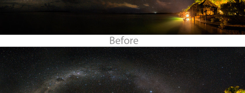
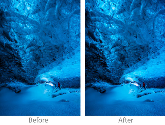
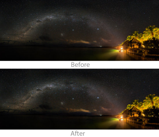
The overall effect is occasional fairly pronounced, as it is in the ice cave image above. More often than not, though, the effect will be more subtle, like it is in the image of the Milky Way. It will not make a bad photo good, but it can add a nice finishing touch to many of your images.



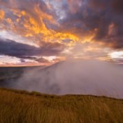
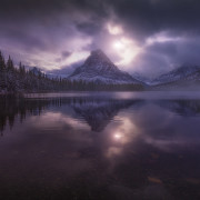


Cool post but I’m also struggling to see the pop. Both images look very similar! I’m using a Mac to view them.
HI Mike, check out my reply below with animated gif.
sorry, I don’t see any difference between before and after, neither for the ice cave nor for the milky way…are you sure you uploaded the correct comparison images? Or do you need to pixel peep to 100% to see a difference?
I can see a clear difference between the two images on three different screen (on my phone, on my monitor and on my laptop screen). While the difference is not glaring as seen by over saturated images…it is certainly there both in terms of contrast and textures.
I do agree with you that a bit more glaring difference would have made a better example.
It’s easier to see the difference if you do this on your own images on a separate layer in Photoshop, and then hide and view the layer to see the changes. I probably should have started with images with less contrast and done a stronger adjustment to show the changes more clearly. Here’s a link to an animaged gif that should show the difference better using the same images as above: http://www.collierpublishing.com/IceCave.gif