Q and A: What Makes a Winner?
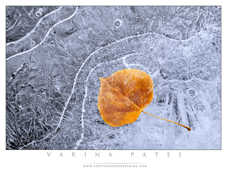
Jay and I don’t enter competitions very often, but every now and then it’s fun to print up a few images and see how they do. I recently entered two images at a Cleveland Photographic Society pictorial competition. The two images tied for first place. Now, that’s not necessarily typical. Sometimes I win, and sometimes I don’t. But it did get me thinking. How can a photographer – any photographer – select a “winner” for entry in competition?
There’s no sure answer, but there are a few things to consider. I’ve judged my share of competitions, and I’ve heard comments from hundreds of judges over the years. The fact is – there’s a lot of repetition in comments from the judges. They notice the same things over and over again. So here’s a checklist. This is what I’m thinking when I choose an image for submission. I’d love to hear your comments. I’m sure many of you have experience on this subject! Add to the list!
1. It’s all about IMPACT.
Choose an image that grabs the eye of the judge. Your image has to stand out among many – so make sure it catches the eye.
2. Simplify!
Get rid of distracting elements. I can’t begin to count the number of times I’ve heard a judge say “That thing in the corner is really distracting…” I’ve said it myself. Many times. It’s tempting to include as much as possible in your photograph – that pretty tree is so nice, and the little barn in the distance has such character, right? In the end, less is more. Do those elements add to your image? Remove any clutter before taking the shot or compose the shot so that only the most important elements are included. If necessary, crop.
3. Get your exposure right.
Technical stuff matters. Check for blown highlights, and make sure the image isn’t over or underexposed. Correct exposure makes everything better.
4. Don’t overdo the processing.
Some judges love it, and some hate it. But in most cases, if processing is distracting, you’ll end up losing points. Be careful of over-saturated colors, over-sharpening, and unnatural-looking HDR. Also keep in mind that many judges have seen the same Photoshop filters a thousand times. It may look new and exciting to you – but unless it really enhances the image and makes it unique, skip it.
5. Provide a clear “point of interest”.
How many times have you heard someone say, “I don’t know where to rest my eye.” Make sure there’s a clear point of interest. Otherwise, you’ll hear about it.
6. Crop carefully!
“Give your subject space, but not too much space.” “Get rid of distractions.” “Don’t crop off someone’s ears or the top of their head.” “Don’t chop off the legs of the elk…” or “the reflection of the duck.” “Either cut out the element – or include all of it… don’t cut it in half.” Cropping depends upon the image, and the rules are flexible.
7. Presentation matters.
It’s usually best to choose a black or white mat when you enter an image in a competition. Your photo may look great in a double gold and green mat – but if the judge finds it distracting, you’ll probably lose points. Let the image stand on it’s own merit. The images here were presented at the largest possible size (11×14 for this particular competition) with a three-inch white mat.
I’m sure there are a thousand more – but those are the bits of advice that come to mind right away. What do you think? Do these two competition-winning images meet the standards I’ve listed here? Please feel free to add to the list by submitting a comment. I’m sure many of you can offer some pretty good advice to others who are nervously sorting through images in search of that one winning shot.


Very good, being a beginner I am interested in all I can do to improve my photography. Your feed back would be of a great benefit.
Yours Sincerely
I hope the free tips on our blog are helpful to you, Dale! Good luck with your photography.