How to get colors in landscape photography right
When it comes to colors in nature, landscape photographers have a unique opportunity to get the colors right whether it’s in camera or in post processing. There are several ways to make sure we can achieve the proper colors in landscape photography that suits the image and has an overall pleasing effect that will enhance our scenes.
I personally love color photography. The colors are what speak to me while out in nature. Getting the colors right for my final image is important to me.
Getting it Right in Camera
There are a few ways you can photograph your nature scenes to get it right in camera. By doing so you may not have to do much in post processing to be happy with the results of your photograph.
1. Check the Weather – Weather & lighting play a very important part in nature photography. Depending on the scene involved with your photograph you have in mind, be sure and plan accordingly. I have found that even shooting trees during a recent rain on a cloudy day can really enhance the colors of the leaves.
Another example is if you are photographing waterfalls you may want to plan to shoot on an overcast or rainy day. Sometimes these are the best conditions to photograph waterfalls for bringing out the colors in the surrounding foliage.

Toketee Falls within the Umpqua National Forest, Oregon.
2. Using Filters – Circular Polarizing filters can enhance the colors already in your scene. I use them for cutting glare particularly on water but also to bring out the colors more as it can make the colors richer.
3. Check Your Histogram – Make sure to check your histogram to properly expose your image. It can be difficult to bring out the colors you see in the scene if your image is too dark. Always have the histogram handy to view when setting up your photograph.
Getting Colors Right in Post Processing
Photographers hear it all the time, “Is that Photoshopped?” I believe we get this question all the time because the general public that doesn’t have experience with photographing nature. They take the picture with a point and shoot camera or their smart phones. Shooting like that means they are letting the camera determine what the colors should be. The photos often may look either too dark because the dynamic range in those cameras often are not great or the colors may look unrealistic. They have come a long way however over the years and some of them do a much better job than others.
Photographers often shoot in raw so they can manipulate the image if needed in programs like Lightroom and Photoshop during post processing. The raw image allows us to bring out those colors more like we saw while out shooting the scene. Sometimes it even means desaturation of the image as the colors may be way to brilliant to make an overall beautiful photo.
Here’s an example of a photo I took that was much more saturated out of camera than I liked. I had to tone down the colors for my liking. It was photographed on a very cloudy, rainy day so the colors just popped!

Oak grove in Oregon photographed on a raining, overcast day.
There are ways you can enhance your images during post processing which I will highlight below.
- Adjusting saturation and vibrancy – You could always move the sliders in Lightroom to achieve this. It may or may not be needed, but adding a little might just do it.
- Dodging or Burning – I sometimes do a little dodge or burning in Photoshop to make the colors a little more brilliant. More like what I saw with my eyes out in the field. When dodging or burning areas of your photograph, you don’t necessarily need to use the default black or white. You can use the color picker to choose a color within the photo to bring in more of less of a color within the scene.
To do this, open your photo in Photoshop. Create a layer to burn or dodge. I use Tony Kupyer’s TK Actions which is quick and easy. The black would be to burn, the white to dodge.
For this example, I’m choosing to burn. You will need to click on the foreground color arrow to switch it from black or white. Should default to black. If so you are set. To burn, click on the black square in the bottom left. This will bring up the Color Picker (Foreground Color).


An example of creating a burn layer in Photoshop.


Photoshop example of the Color Picker.


Brush Tool in Photoshop where you can change the size and hardness.
Use the dropper to choose a color from your image. You can then dial it in by moving it around within the Color Picker. Once a color is chosen, you can use the Brush Tool to paint onto your scene where you feel it’s appropriate. I wanted to bring out the colors more in my clouds that I remember happening at the time I took the photo. Move the brush in a circular motion. Choose the brush size, hardness, and opacity. You may need to open a couple of layers to get the desired effect you want.

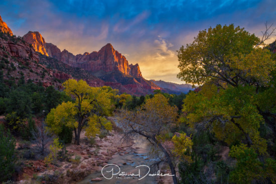
After Post Processing: Zion National Park, UT
- Color Temperature – Maybe the color isn’t exactly right on your screen, as you’ve remembered it in the field. You can adjust the color temperature in LR or Photoshop to bring it closer to what you’ve envisioned. I find that sometimes warming up or choosing to cool down the scene a bit can get me the desired effect I want with my colors.
I’m sure there are other ways to get your colors right in your nature photography images but I hope these few tips will get you started in thinking about ways to change them to your liking. As always comment below if you have any questions or would like to share what you do!
About Author Patricia Davidson
Patricia Davidson is a professional landscape and nature photographer based in Oregon. She spent over twenty years on the southern Oregon Coast developing her landscape photography skills on the beaches and in the forests of the Pacific Northwest. In 2015, she set off in an RV on an epic four year journey to photograph the American West. Her work has been featured in Landscape Photography, Country Woman, To & From, Outdoor Photography, Loaded Landscapes, Fuji X Passion, the AAA Oregon / Idaho Atlas, Oregon’s 1859, 123RF Create, Inspire TV, and My Modern Met. She has written for Visual Wilderness, Scott Kelby’s blog, and Fuji Love Magazine. With a background in the visual arts and web development, Patricia devotes herself to creating images that express her artistic vision and passion for photography, and to sharing her love of nature and the outdoors with the world.


Thanks for the tip about dodging/burning with a color other than black/white. I’ll have to give that a try. It would be interesting to see how it compares.